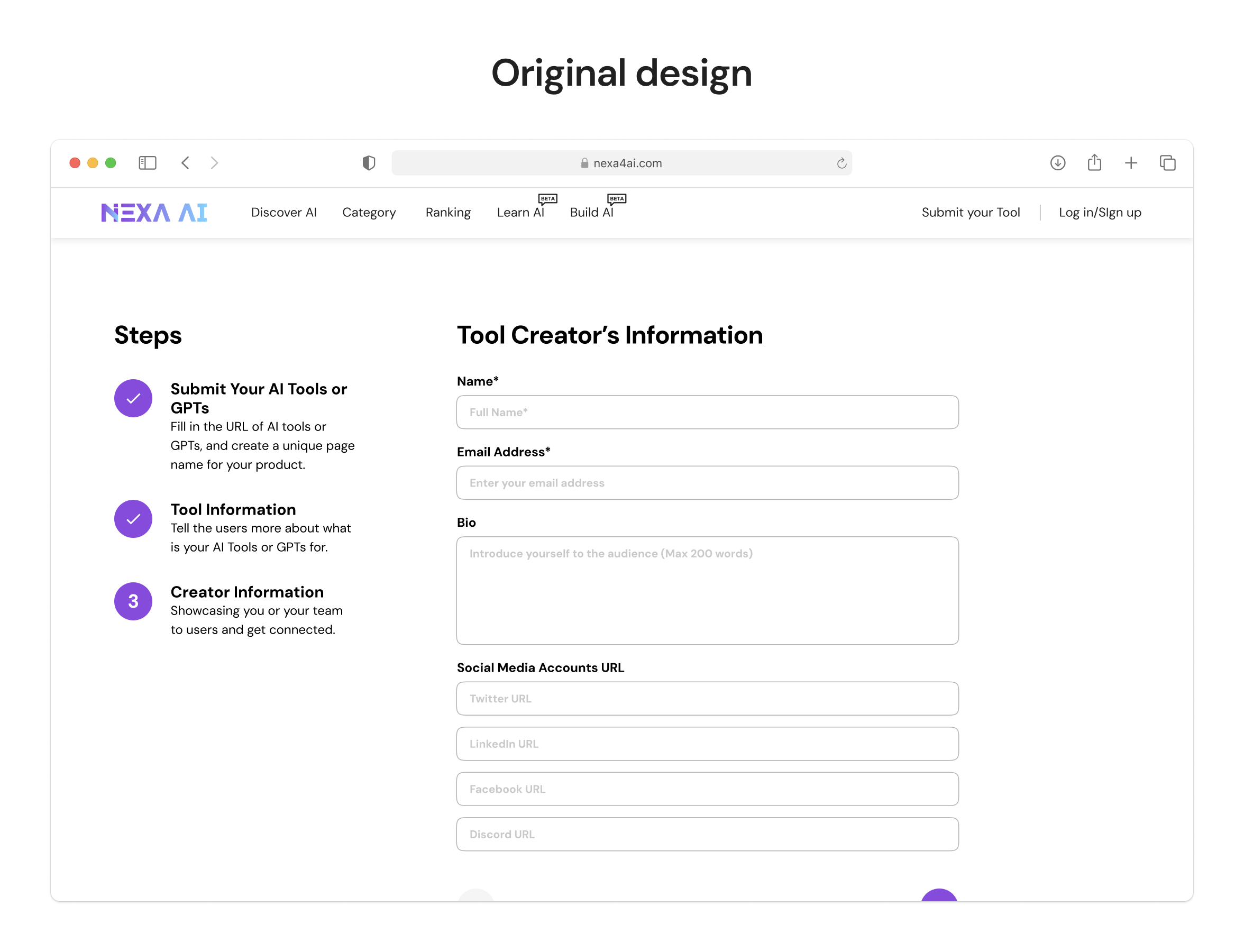
Overview
What is NexaAI?
NexaAI is an AI tools aggregator.
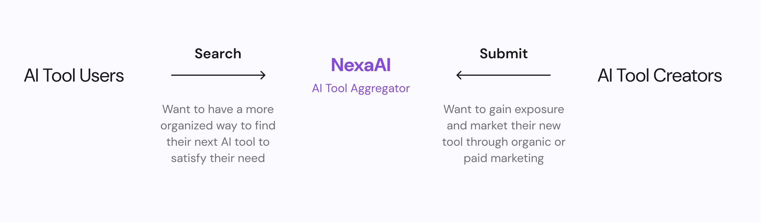
It provides a platform to facilitate:
- AI users who tries to find their next AI tool
- AI tool creators to market their newly created tool
The problem
Through web analytics tool, we discovered that
the dropout rate of the new AI tool submissions flow
is very high compared to site and industry average.
How did we address this issue?
Impact
User experience impact
+86%
in completion rate compared to the pre-redesign version.
-35%
in time spent to complete the flow.
Business impact
+22%
in new tools submissions.
-32%
in engineering hours required for scraping and processing new AI tool data.
Discovery
We conducted research to better understand the
problem we faced.
Exploration: interview
We identified high-dropout rate but lacked clarity on its causes. To gain deeper insights, we
conducted interviews with AI tool creators to understand their experience with the submission
process and uncover potential pain points.
1. Recruitment
Five interviewees recruited from existing users who successfully submitted at least 1
new AI tool.
2. Process
- 25 mins remote video conference sessions
- five initial interview questions + probing
3. Insights
Used affinity diagram to distill insights.
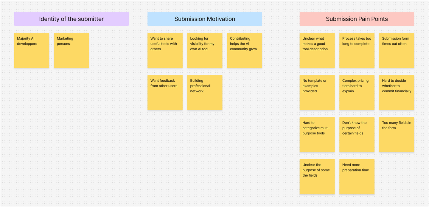
Research insights

1. Time consuming
The AI tool creators found the form relatively
long and noted that fields requiring
marketing materials or financial commitments added extra
effort. This often led
users to pause the process, sometimes forgetting to return.

2. Confusing requirements
Users struggled to distinguish certain fields,
like "feature highlights" vs. "use
cases," leading to uncertainty and form abandonment.
Solution 1: Streamline the process
Reduce submission time and cognitive load through strategic
prioritization.
A deeper look into the problem
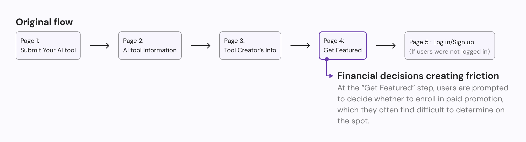
After identifying these key friction points - particularly the cognitive load from complex form
fields and the premature financial decisions - we decided to tackle the root cause through
information architecture redesign.
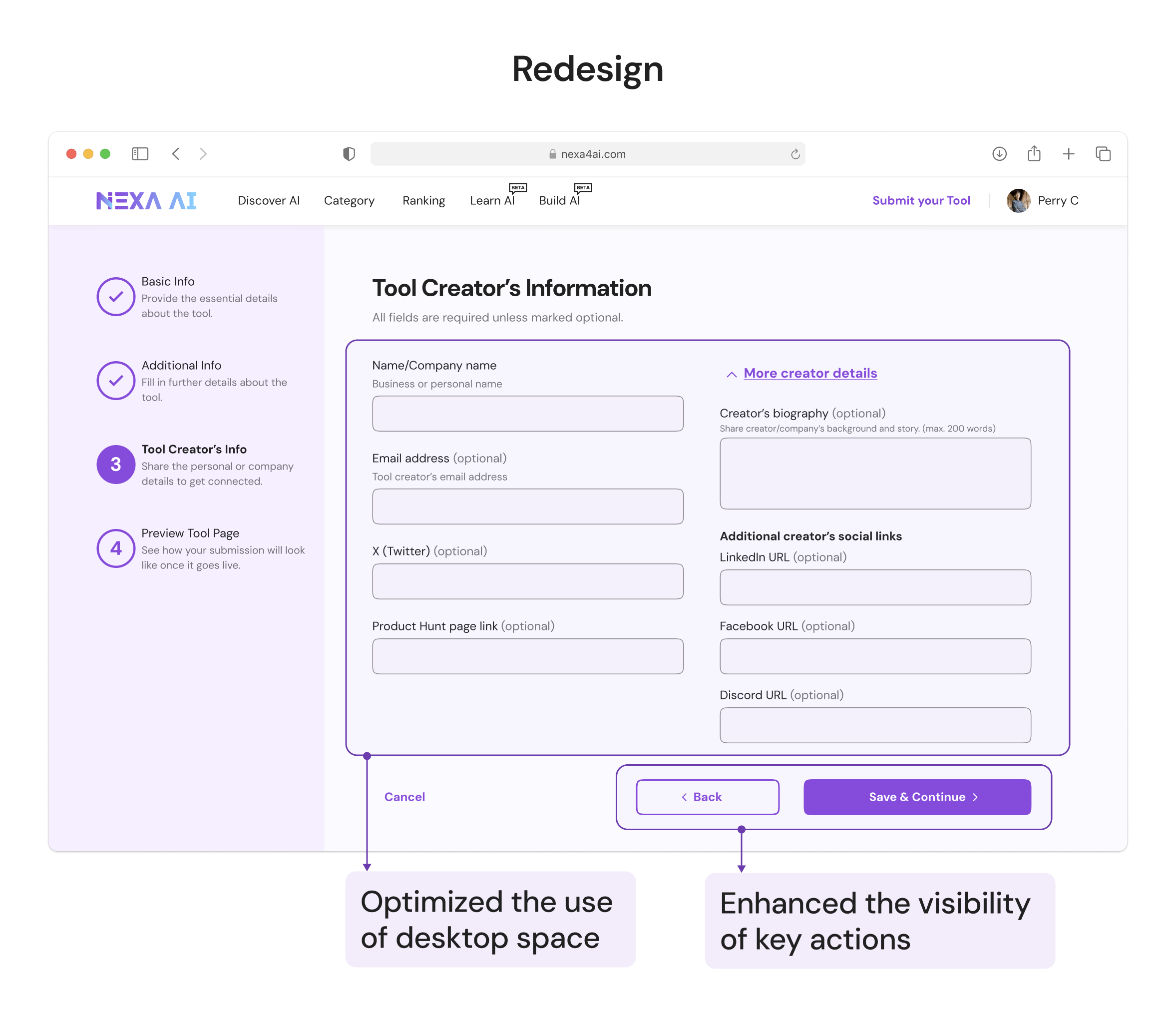
Redesign the information architecture
Gather, prioritize and re-organize form elements
After discussing with our product manager, we prioritized all form elements into four levels
of
importance. I then re-organized these elements based on their priority.
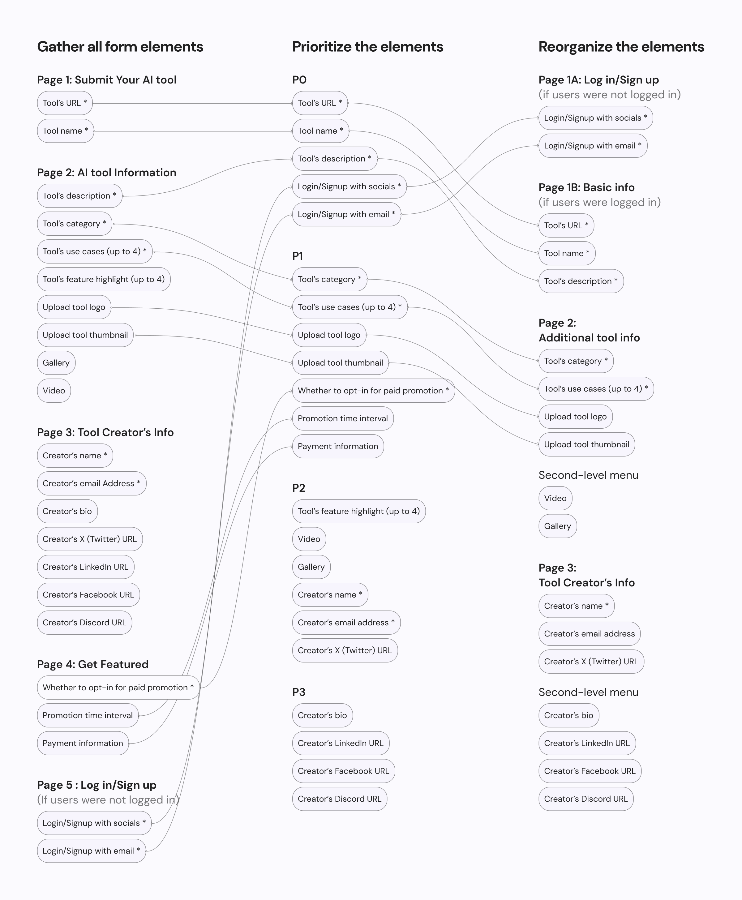
Please refer to the details below for a comprehensive list of changes.
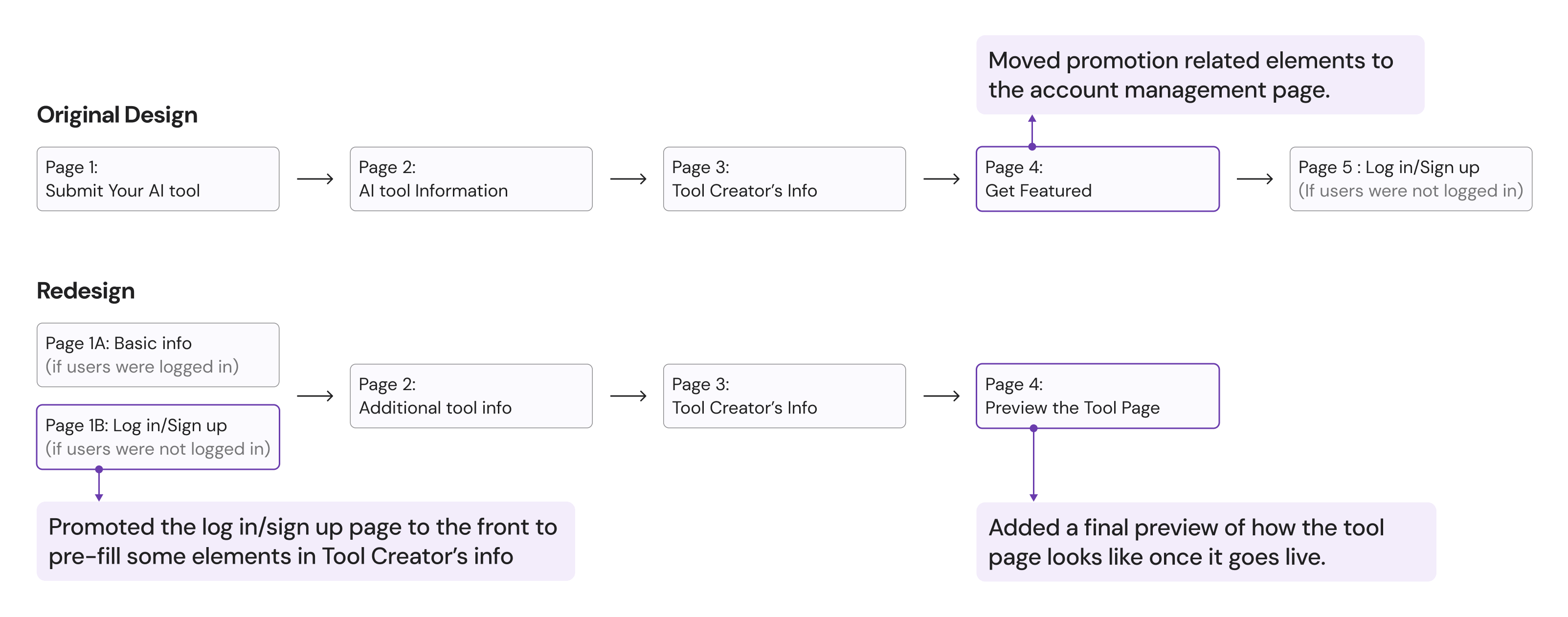
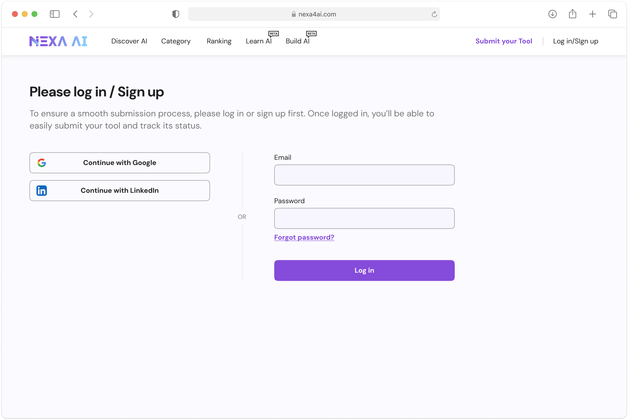
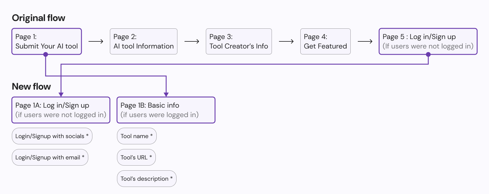
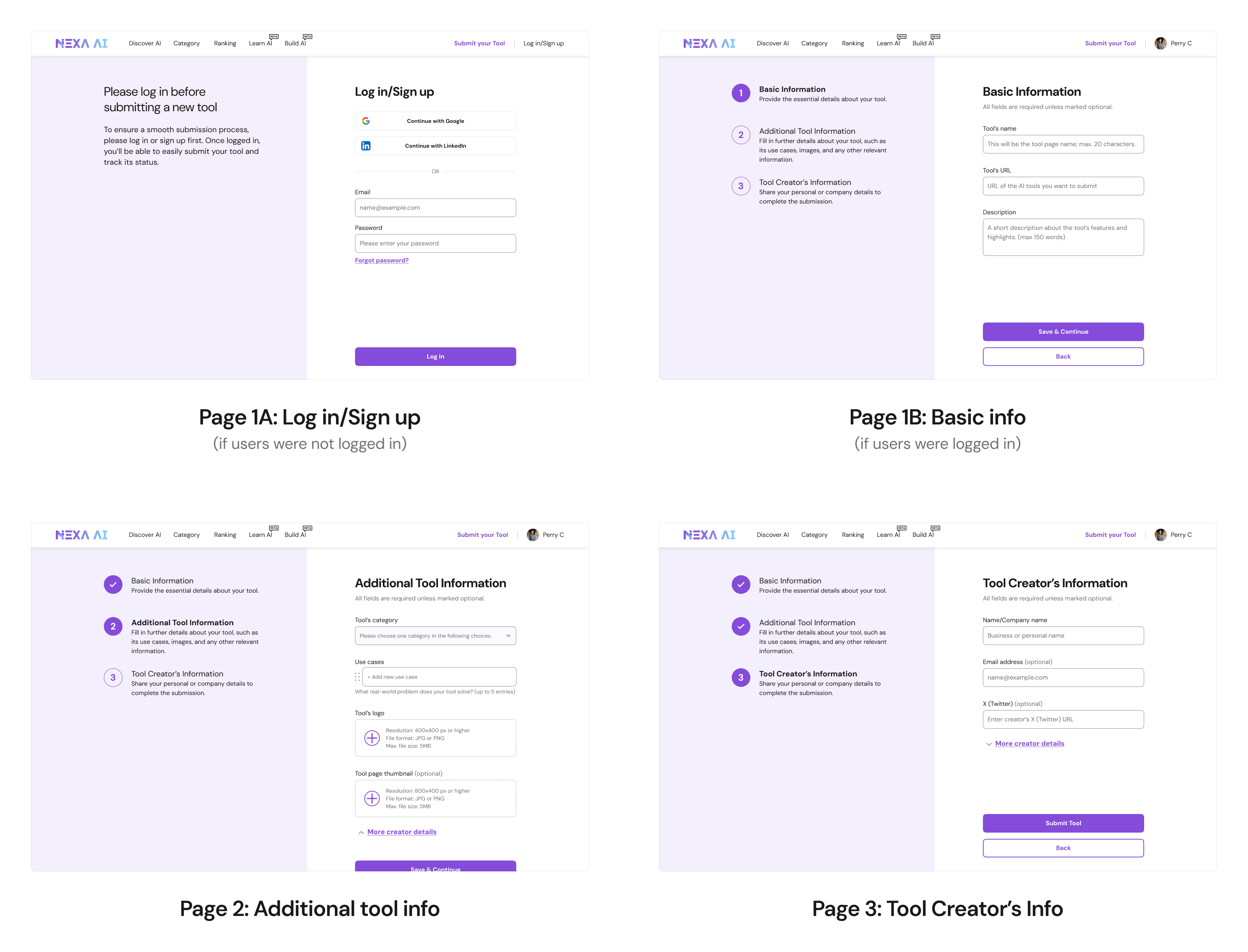
With Priority 0 (P0) elements established, we decided to place them on the first
page
of the form. For users who are not logged in, the first page prompts them to log
in
or sign up. Being logged in allows us to pre-fill
some
of the
creator's information, reducing the effort required
for
submission.
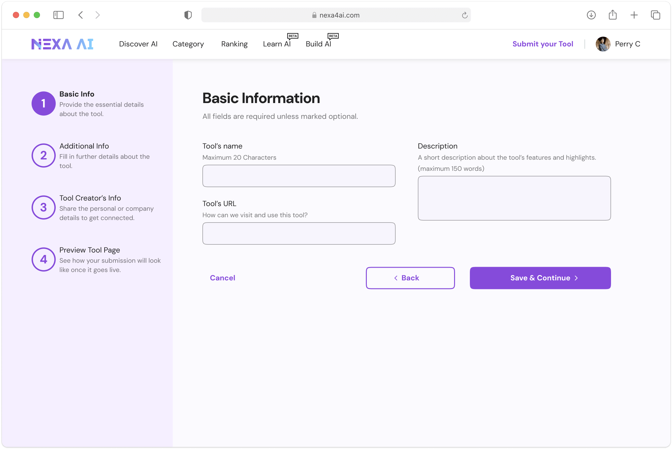
Logged-in users can proceed directly to enter tool's basic info.
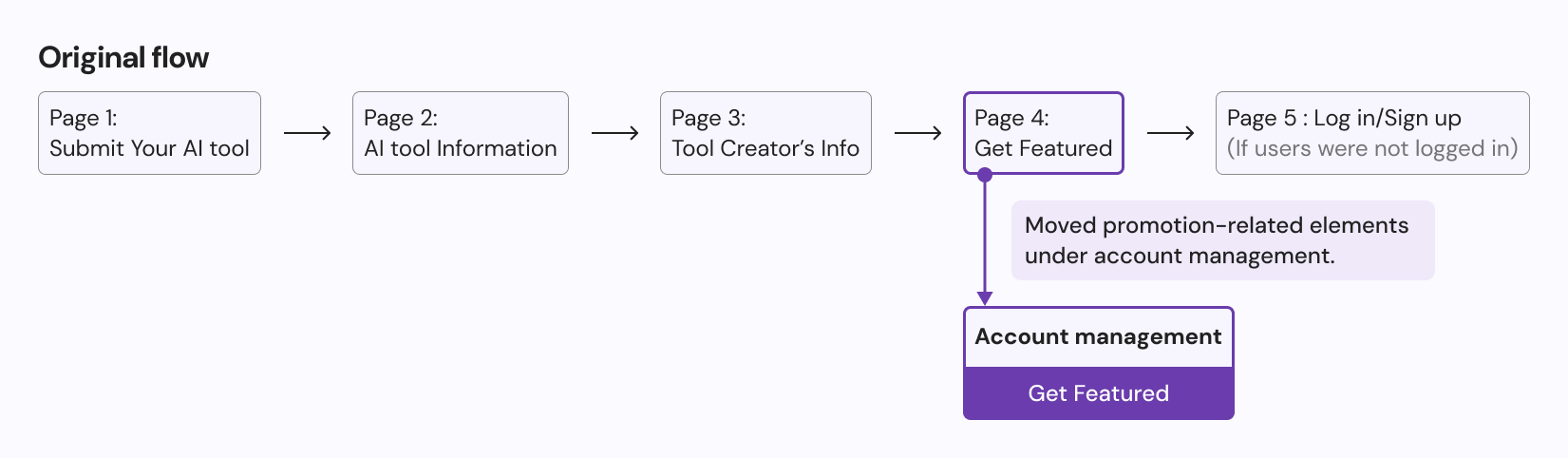
We decided to move the paid promotion elements out of the submission flow because, as
a financial commitment, lingering on this step could
discourage users from
completing their tool submissions. Instead, we relocated these elements to
the
account management page, where we have more space to showcase what the paid
promotion entails.
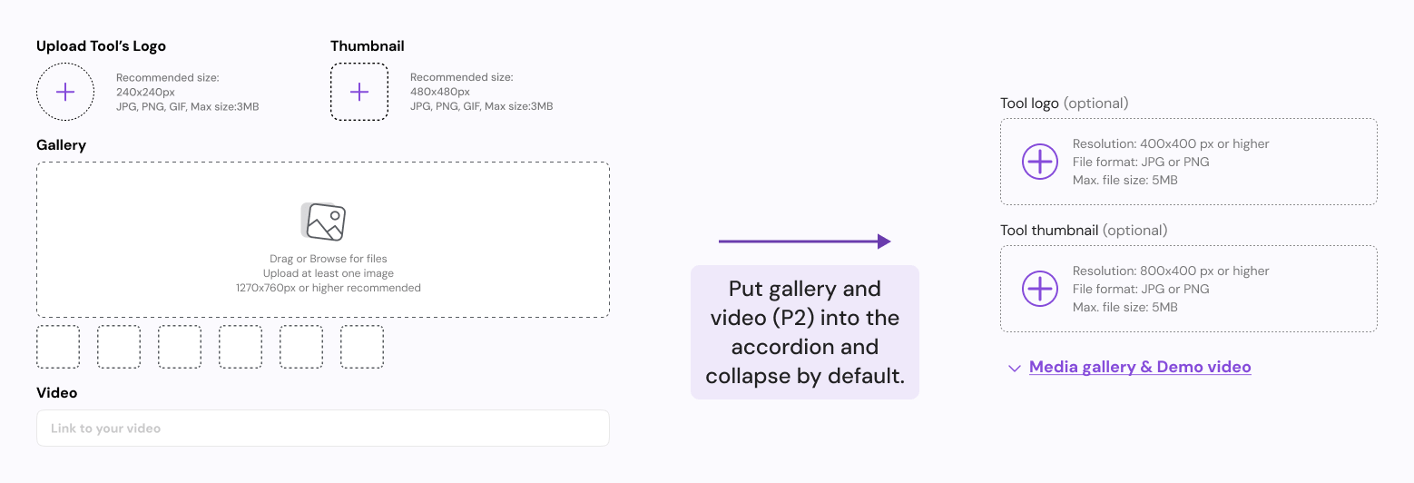
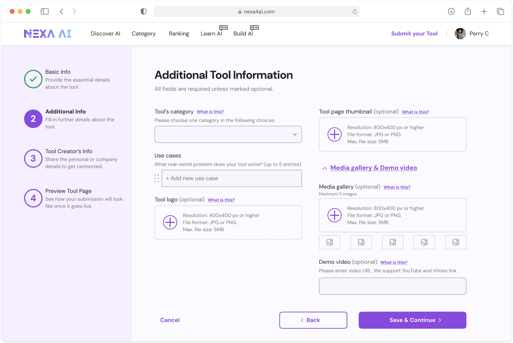
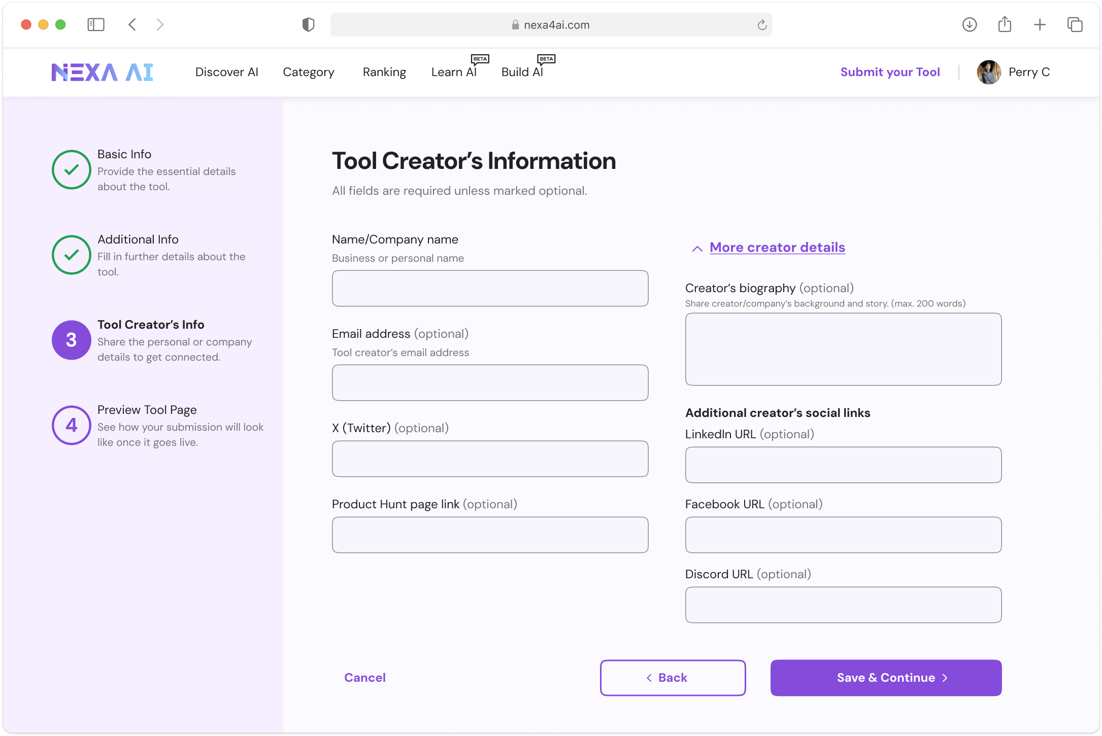
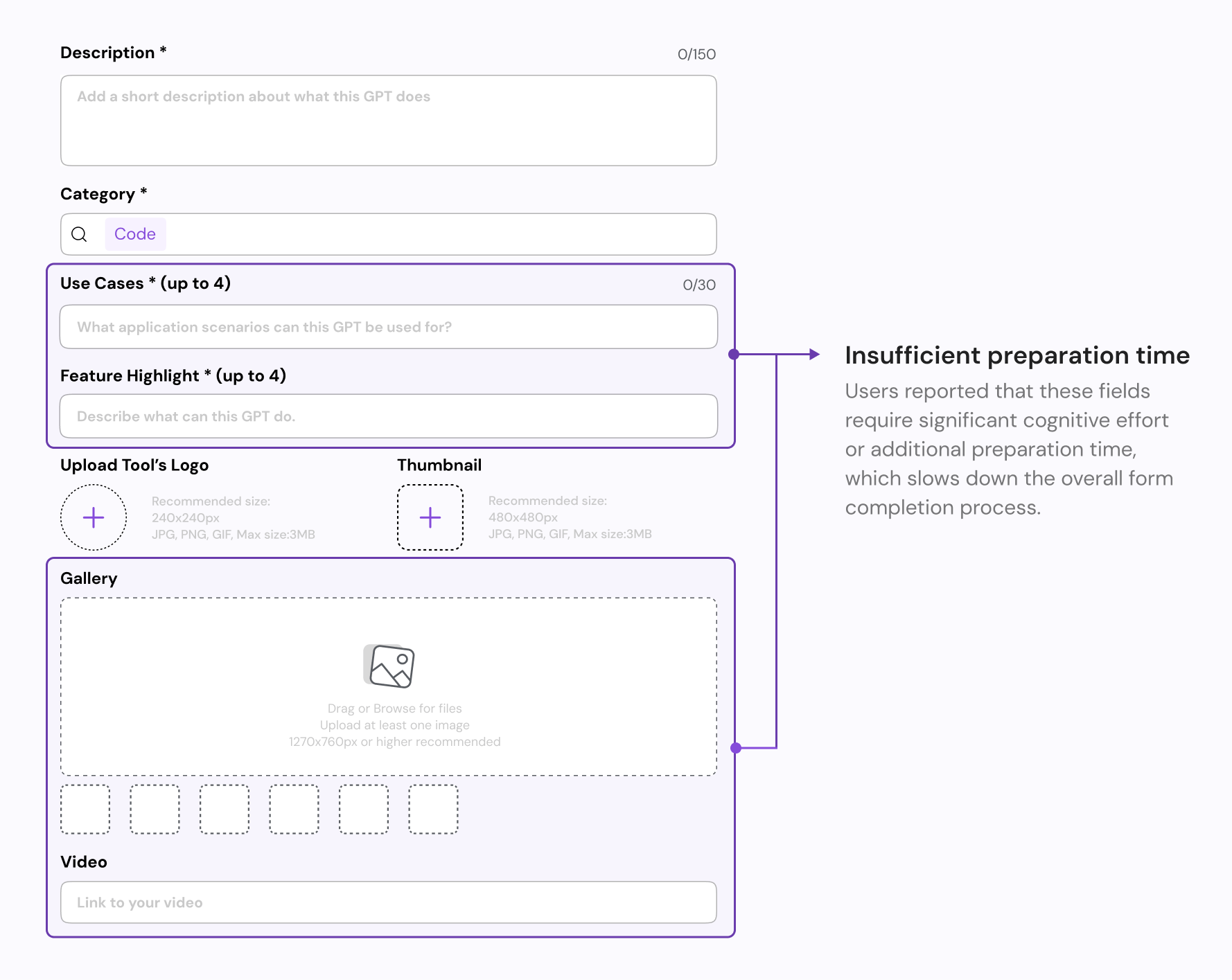
Since some of the Priority 2 & 3 elements, such as creator's
Linkedin link and Tool
gallery, are less important and requires more preparation time, we decided to
place them in a second-level menu, accessible via a
accordion link. This allows
users
who wish to promote themselves to fill in these fields, while others can save time
by skipping them.
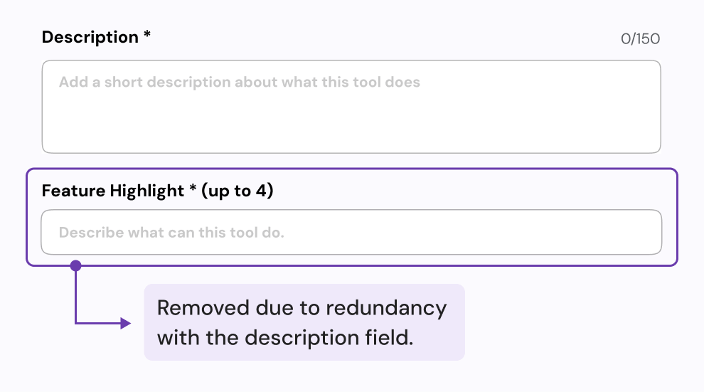
We decided to remove the "Feature highlights"
element, as most users included
this
information in the "Description" field, making
it redundant.
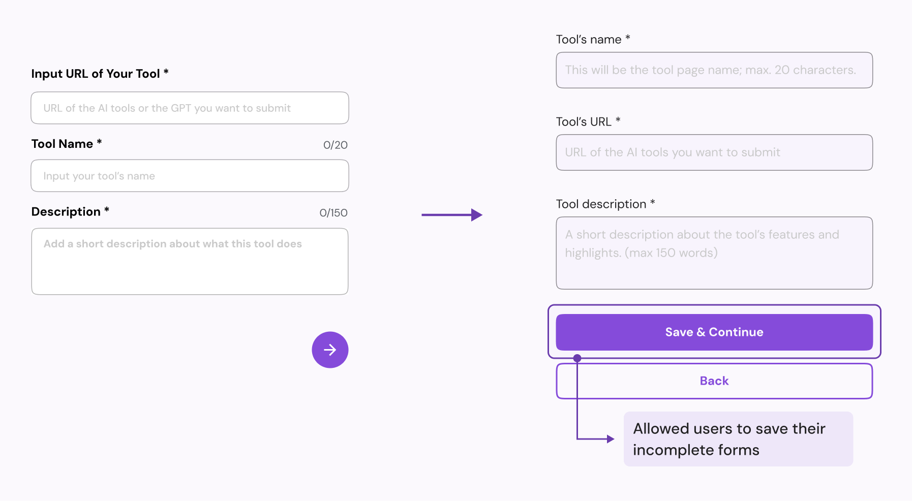
5. Flexible submission timeline
We reduced the save progress functionality to
give users the freedom to
complete their
submission at their own pace. Now when users encounter fields that require
preparation time, such as demo videos or media gallery, they
can save their
progress and return later when ready.
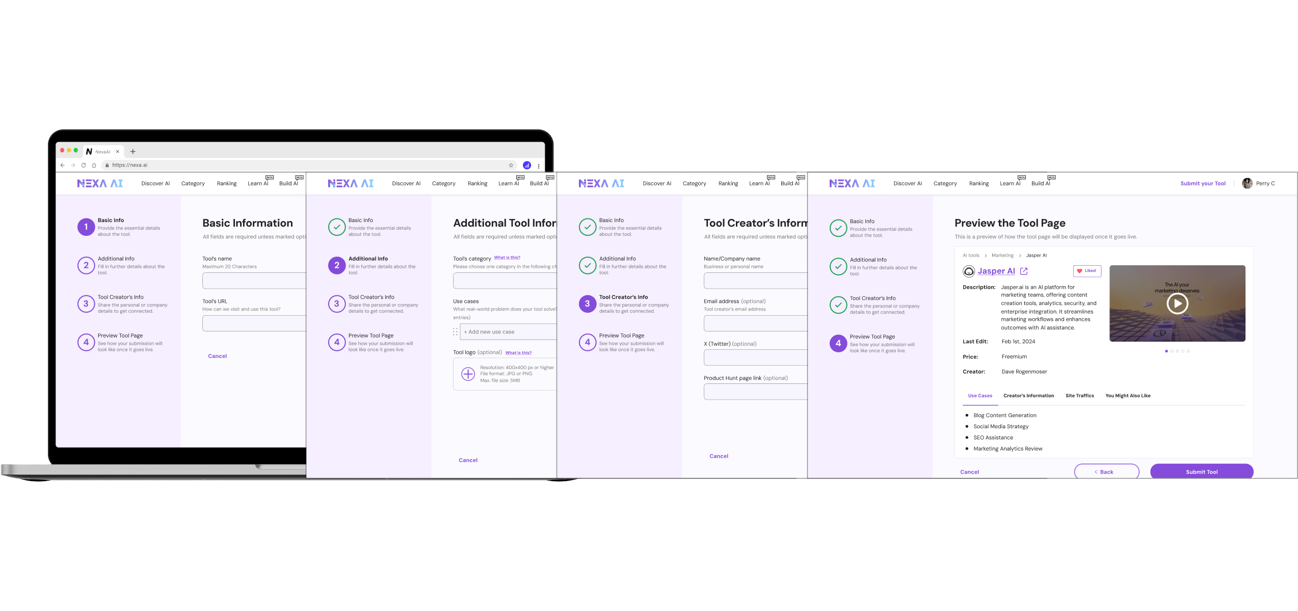
UI designs: Initial iteration
After redesigning the information architecture, I implemented it with a refreshed design.
Design reviews
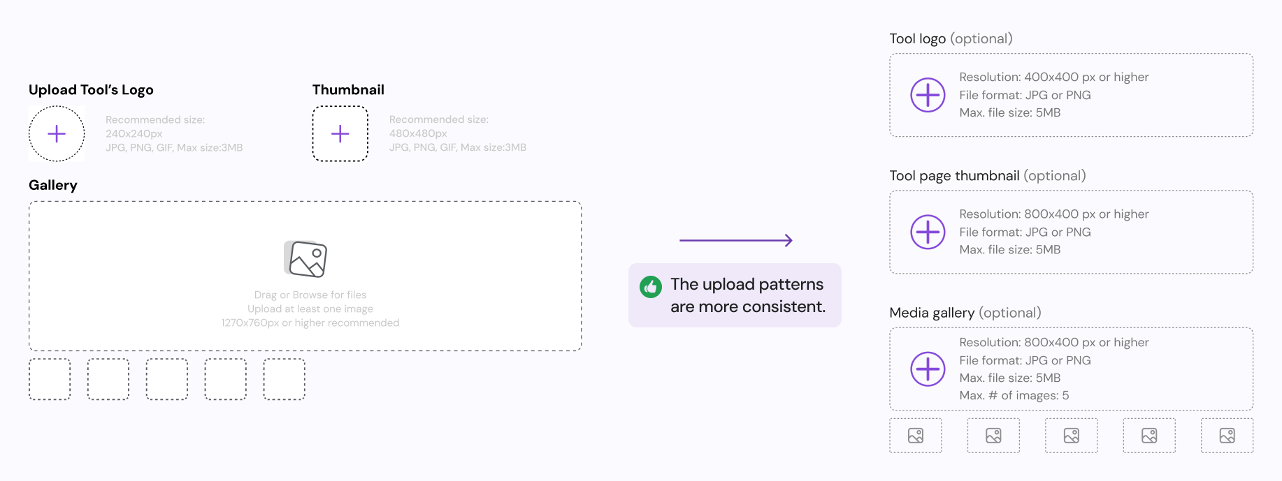
Positive: Pattern consistency
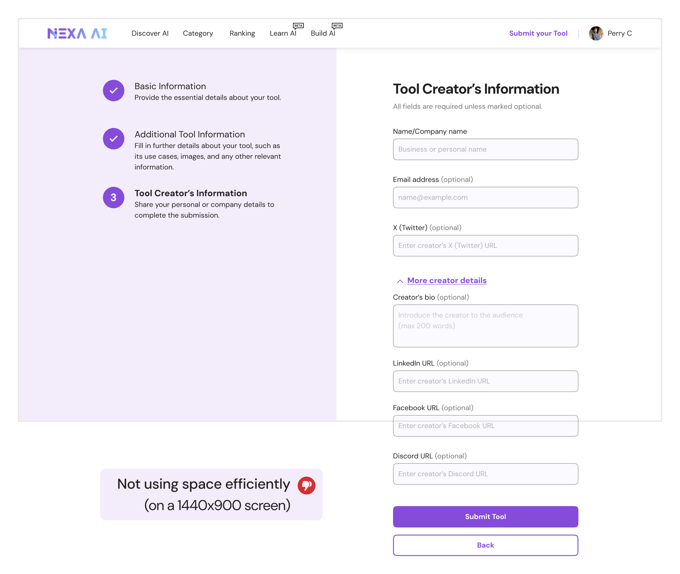
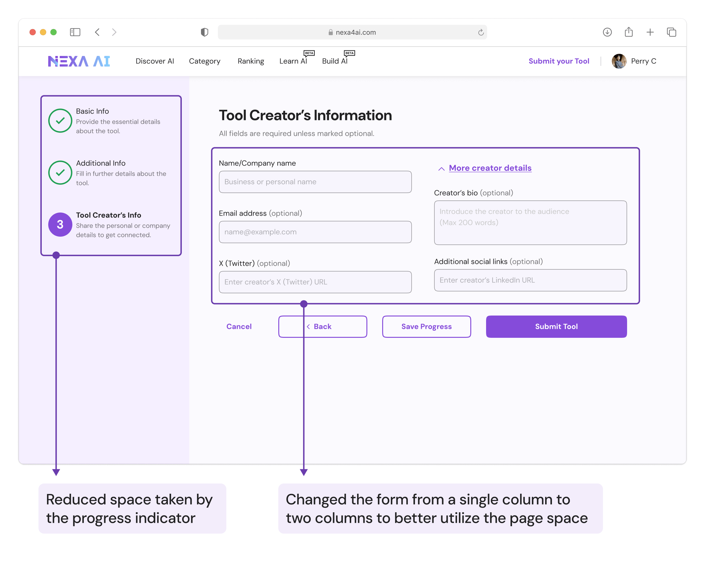
Negative: Desktop layout inefficiency
Teammates noted that while the layout is easy to implement on mobile, it
may not use space efficiently on desktop. This could lead to users missing fields or
overlooking
the "Next" button at the bottom.
Final iteration
Incorporating feedback from design reviews, I refined and improved the previous design.
Solution 2: Offer assistance
To reduce confusion around certain fields, we implemented various forms of assistance to guide
users and help them complete the form smoothly.
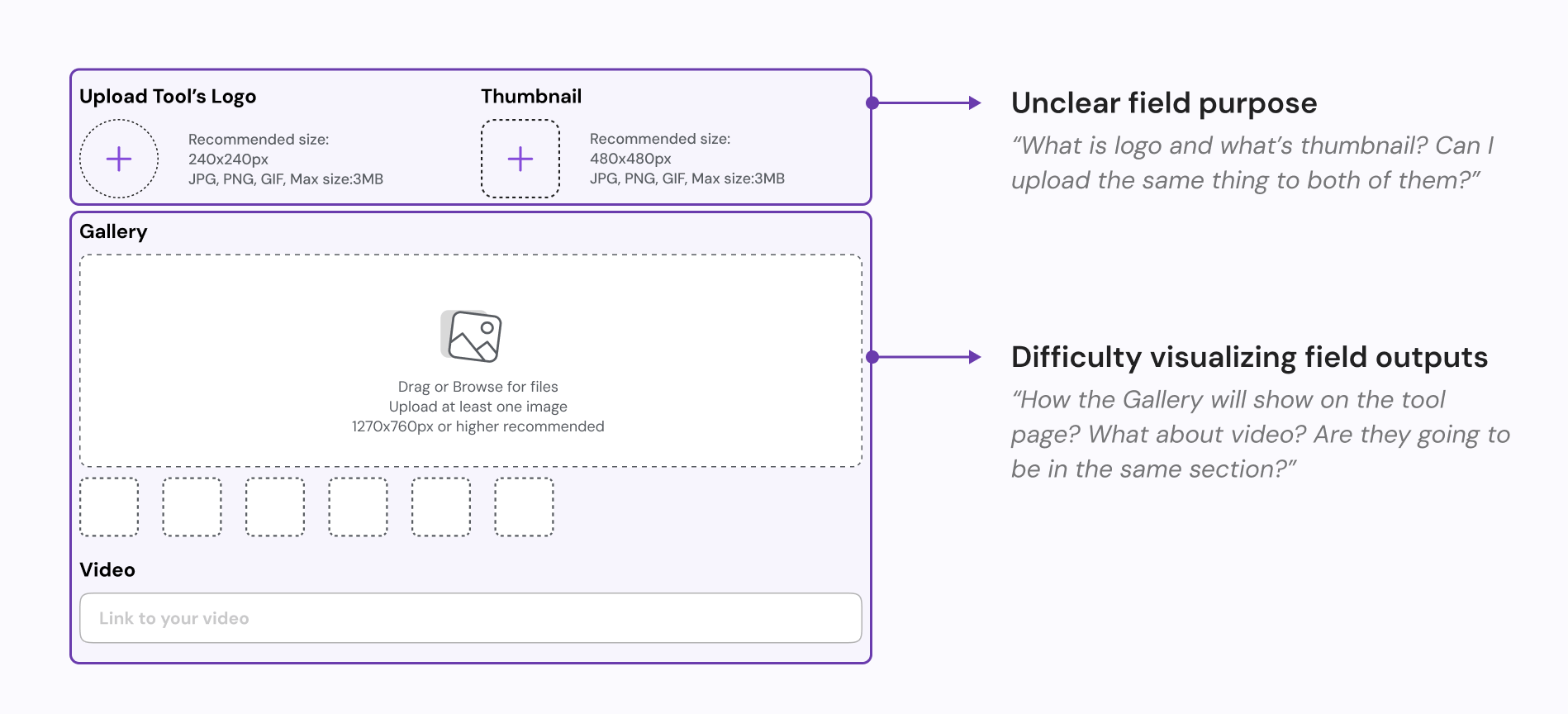
A deeper look into the problem
Through our previous interviews, we discovered that most of the confusion occurs when users fill
out the additional information for their new AI tool on page 2.
Design goals
Based on previous interviews and user needs, we identified two key goals for effective
assistance.

1. Clarity & Guidance
Ensure each form field clearly conveys its intent, helping users understand what
information is needed and why it's important.

2. User confidence
Demonstrate how certain fields will display, reducing uncertainty and improving
confidence during the process.
Proposals
Through brainstorming, I identified two ways of offering assistance.
Proposal 1: Text specifications
Offers additional context or clarification above the input field to help users
understand
what to enter.
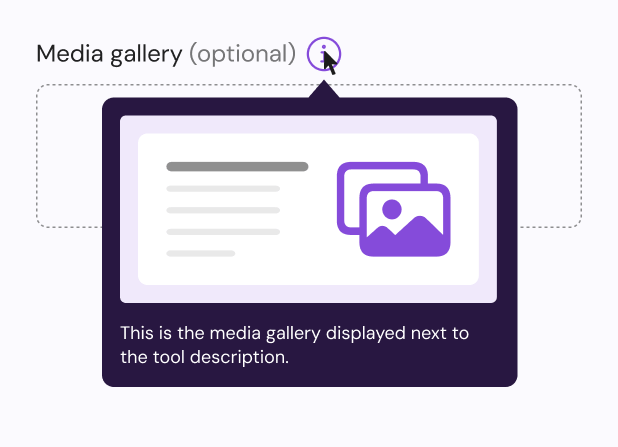
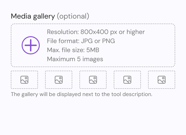
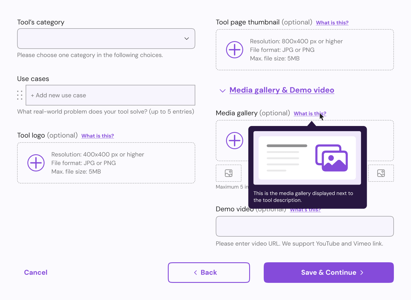
Proposal 2: Image preview
Displays supplementary information when users hover over or click on an icon,
offering
more detailed guidance without cluttering the interface.
Stakeholders evaluation
We carried out stakeholders discussions for the two
plans.
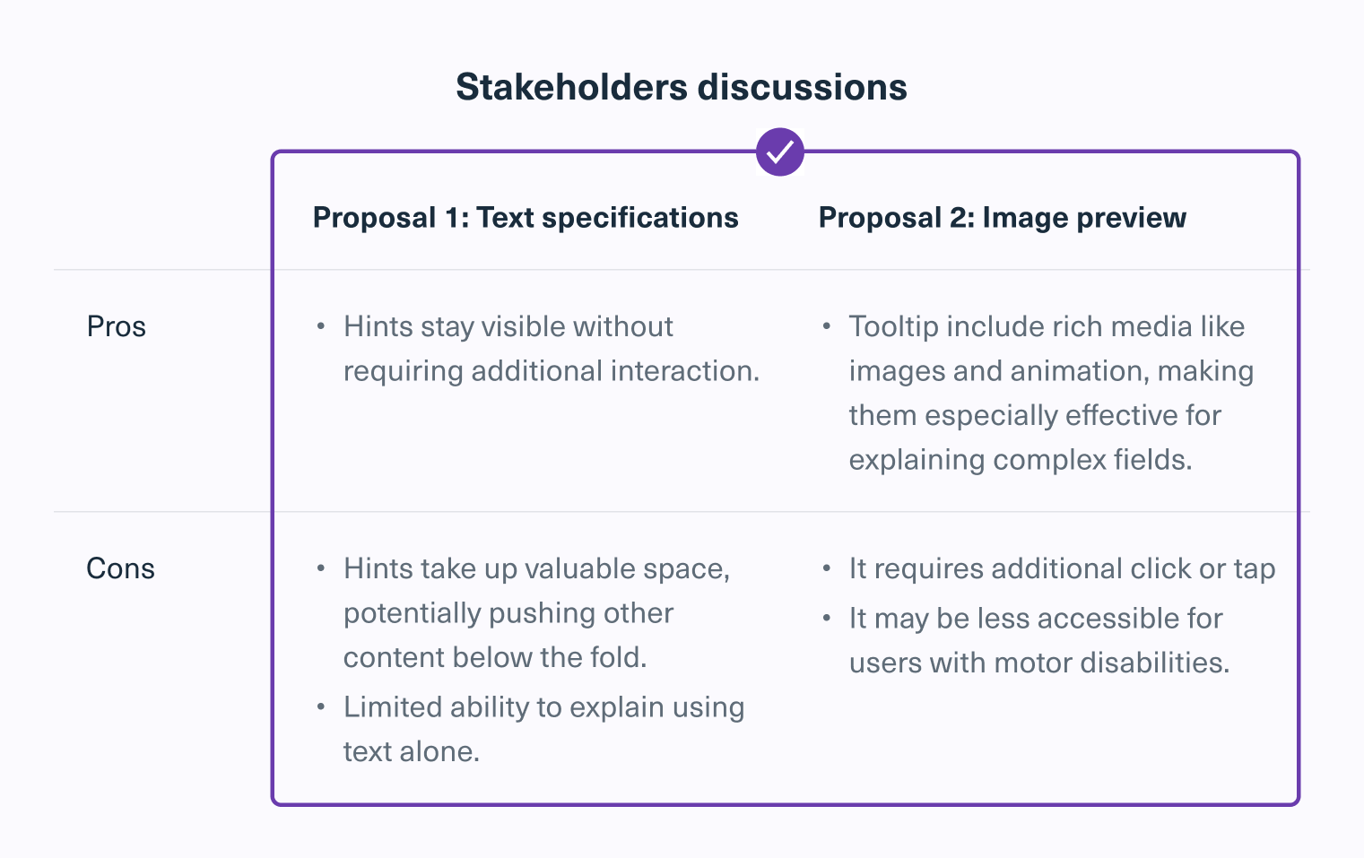
Text specifications provide the best tradeoff by offering
constant
guidance without requiring
extra interaction.
They remain visible, ensuring clarity while maintaining usability across devices.
But some also favored image preview because they provide
clear, detailed explanations,
often paired
with images to make complex fields easier to understand.
In that case, we decided to
combine both approaches. For simpler fields, we’ll use text specifications for quick
and
easy
guidance. For more
complex fields, like “gallery,” we’ll use image preview. Instead of an icon for tooltips,
we’ll
use a text
link such as “What is this?” that shows a rich media hint when hovered or tapped. This
approach makes it
easier to tap on mobile and more accessible for screen readers.
UI design: Initial iteration
Validation: Usability testing and follow-up interviews
After finalizing the direction with approach #2, I proceeded to design the high-fidelity
version and conducted a usability test.
1. Preparation
- Task instruction: “You created a new AI tool and you want it to be on NexaAI.”
- 10 participants recruited from existing users who already submitted at least 1 tool.
2. Process
- 45 mins remote sessions
- Participants were asked to think out loud while completing the task
- Short interviews after the task is completed
3. Insights
We analyzed the usability results and the feedbacks collected from interview.
Findings & Final iteration
The general consensus from usability testing and interviews was positive, with only a few
minor
adjustments needed to improve the overall experience.
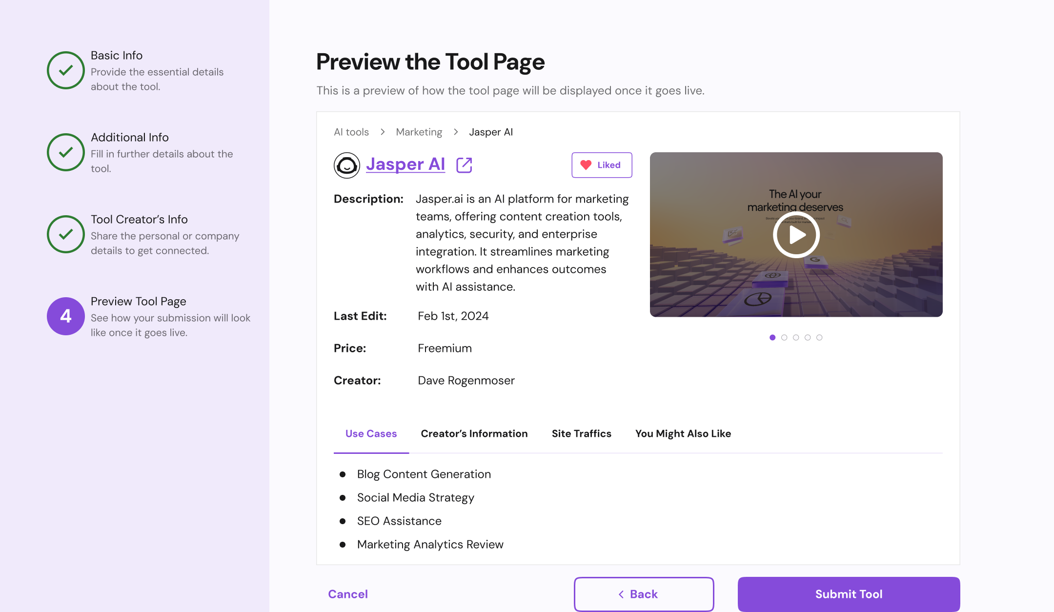
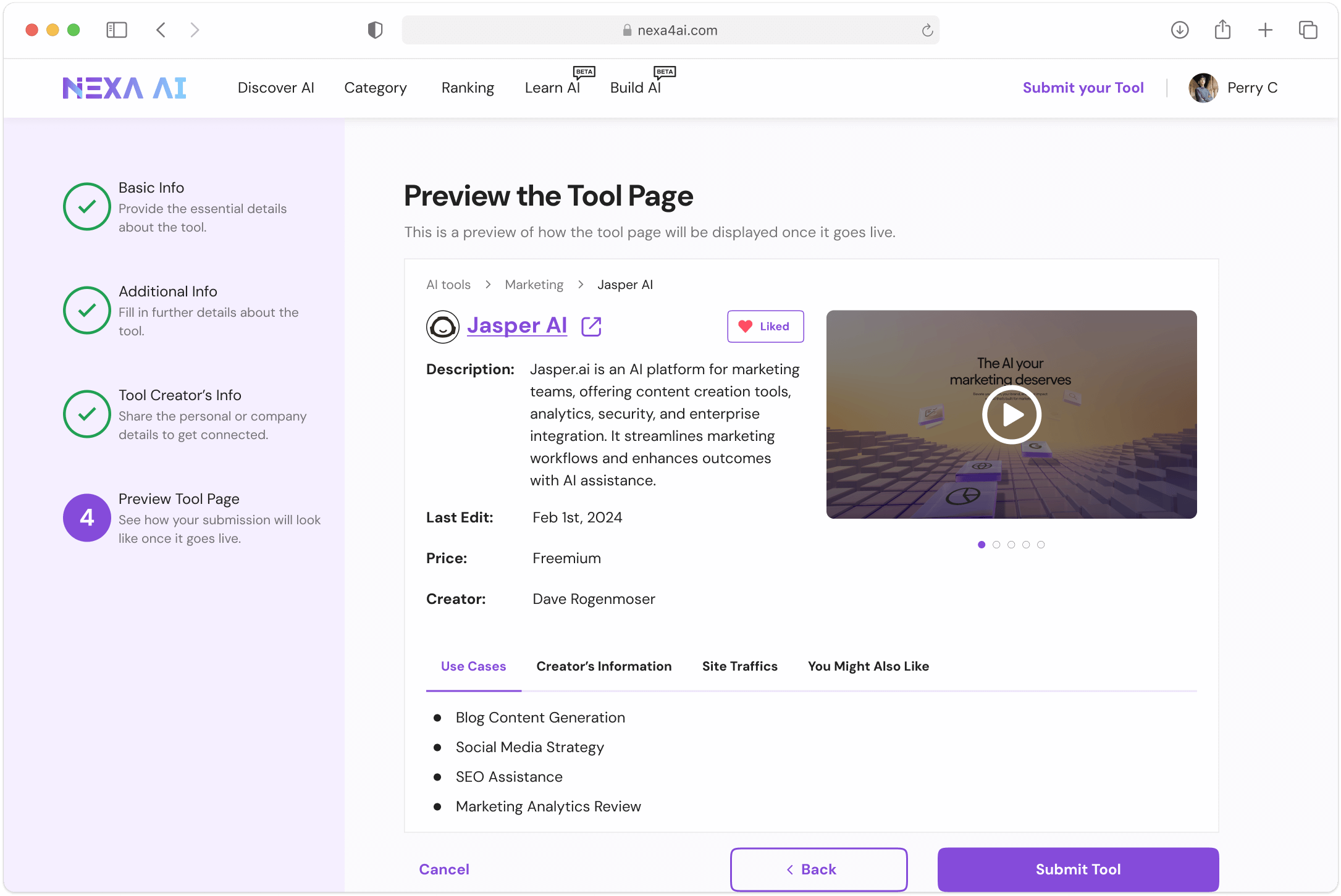
Users were confused with the preview
During user testing, while the
majority of users successfully navigated the submission process, a few participants
mentioned that the abstract nature of the
previews made it difficult to envision their tool's final presentation.
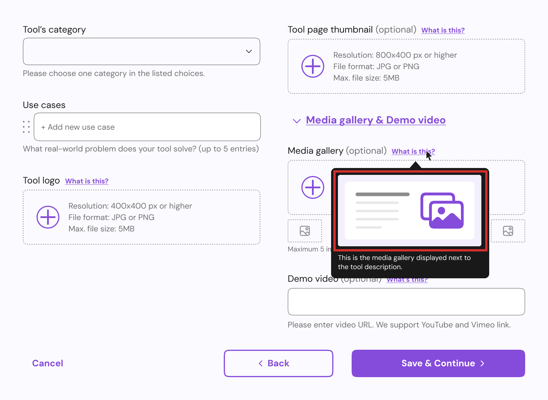
To
address this feedback, we added a
final preview step showing exactly how their tool page will appear when
it
goes
live.