Overview
Client's concern
The active participation rate of the rewards program is low compared to its large user base, which is missing the
opportunities of fostering greater customer loyalty and increasing sales.
How did we address this issue?
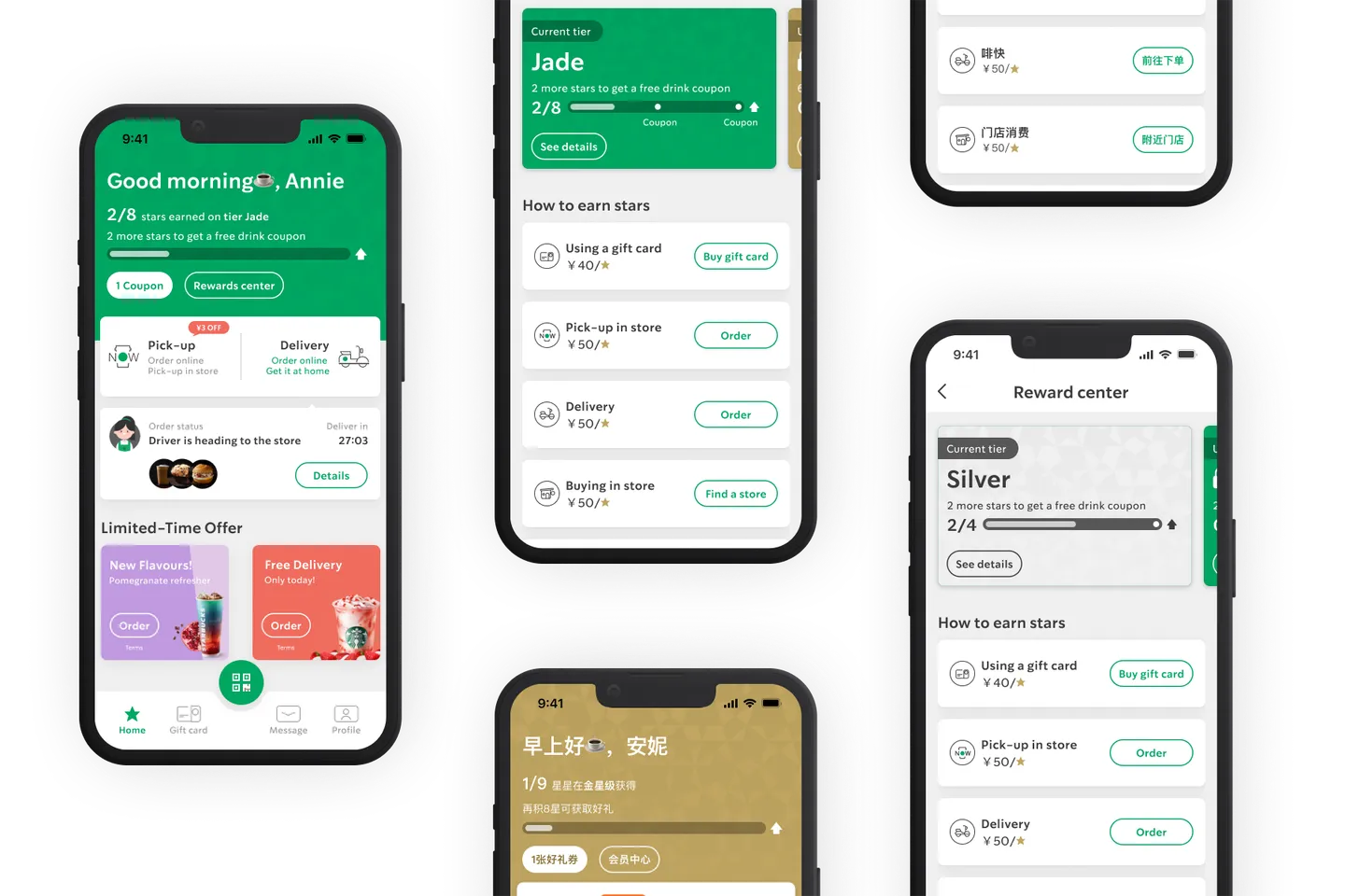
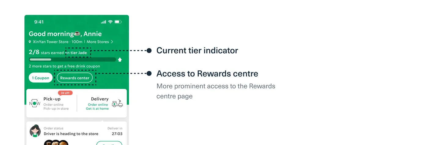
Changes on homepage
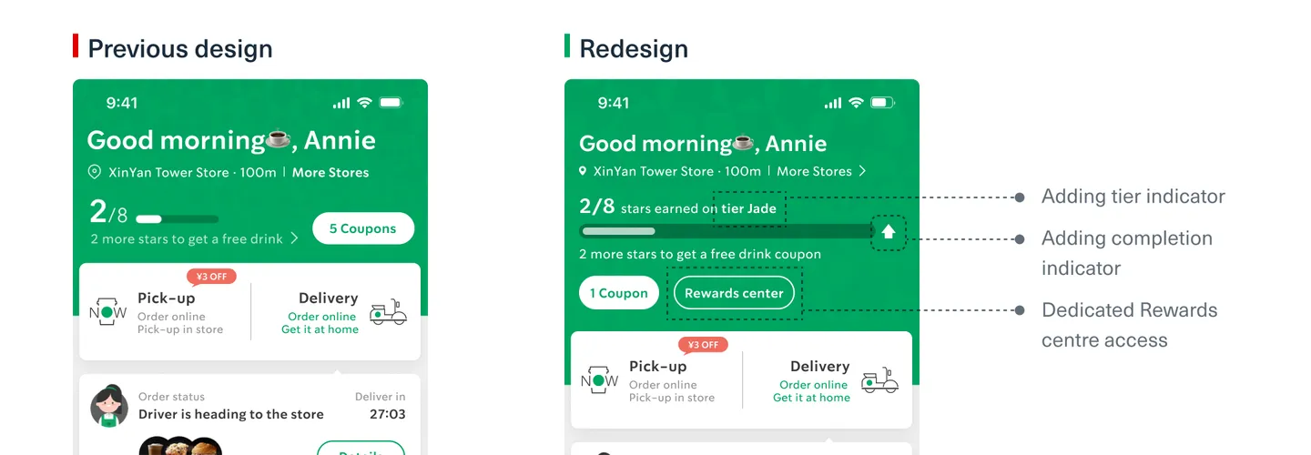
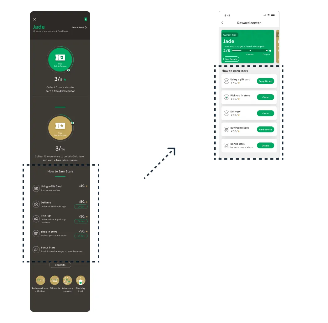
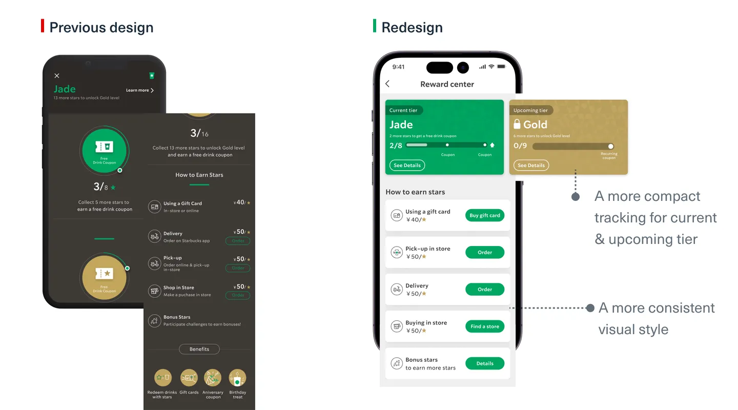
Changes on the Rewards center page
Impact
User experience impact
+36%
in Rewards Center page engagement
+15%
in user satisfaction based on in-app surveys.
Business impact
+12%
in sales made through Rewards Center
+5%
in active rewards program participation
Discovery
We conducted research to better understand the mechanism of the rewards
program and
problem we faced.
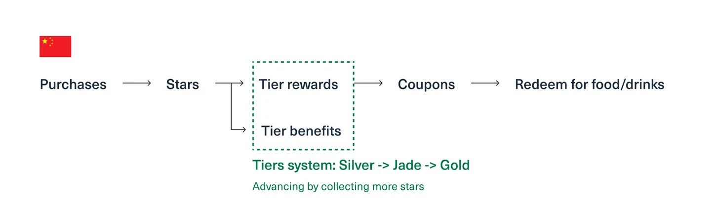
The mechanism of the rewards program
Let's start with an example: the North America's Starbucks Rewards program.
The program is quite straight forward: one makes a purchase, earns
stars, and redeems those
stars for
food
and
drinks.

The Chinese version is different. Rewards are available exclusively
through a tier system,
with
each tier
offering distinct benefits.
Research
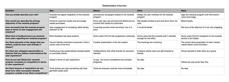
Interviews with Stakeholders
We conducted interviews with both the design and business team to find out their
priorities and
needs.
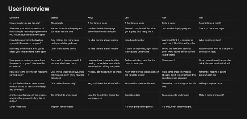
Interview with existing users
# of participants: 5
Desk research
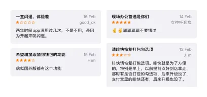
We analyzed iOS app store reviews and in-app survey results.
Research insights

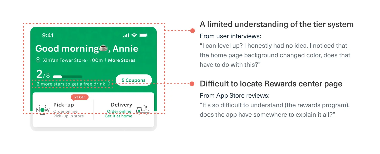
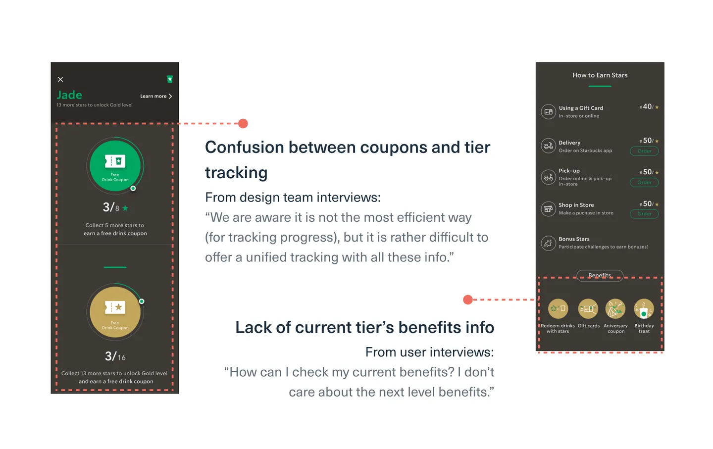
1. Low awareness
Users lack awareness regarding the rewards program and its tier system.

2. Confusing tracking/benefits
information
Users consistently find it challenging to grasp the information presented in the Rewards
center.
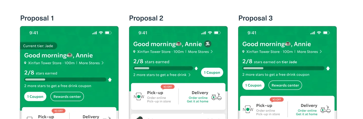
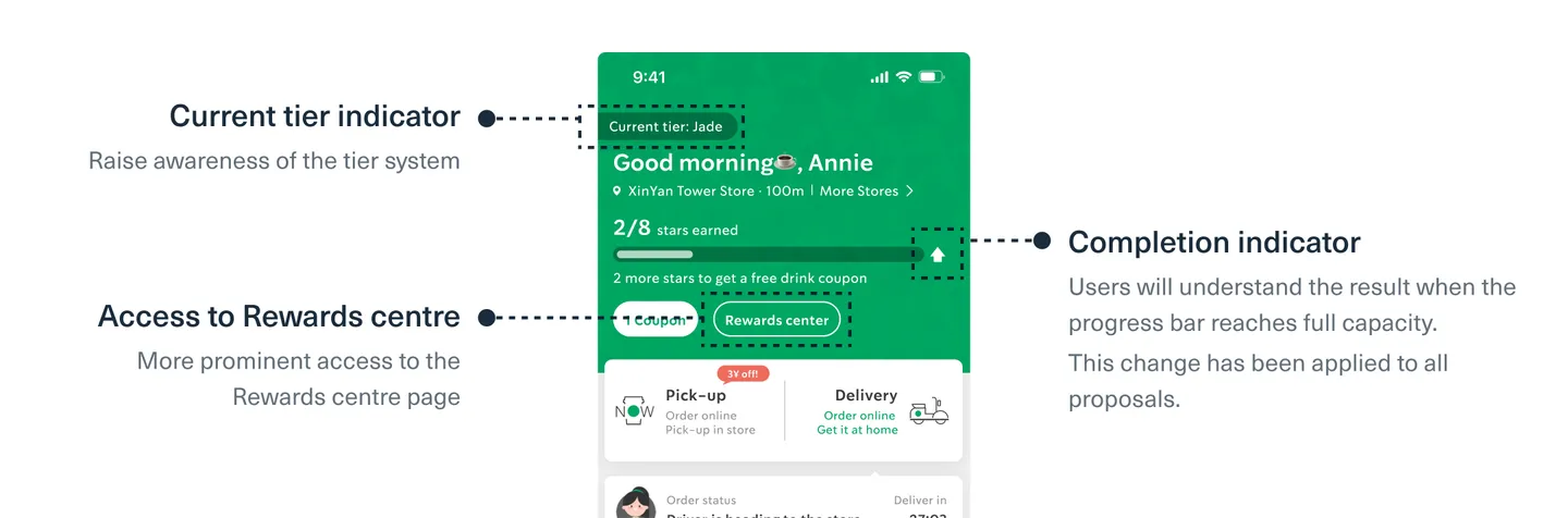
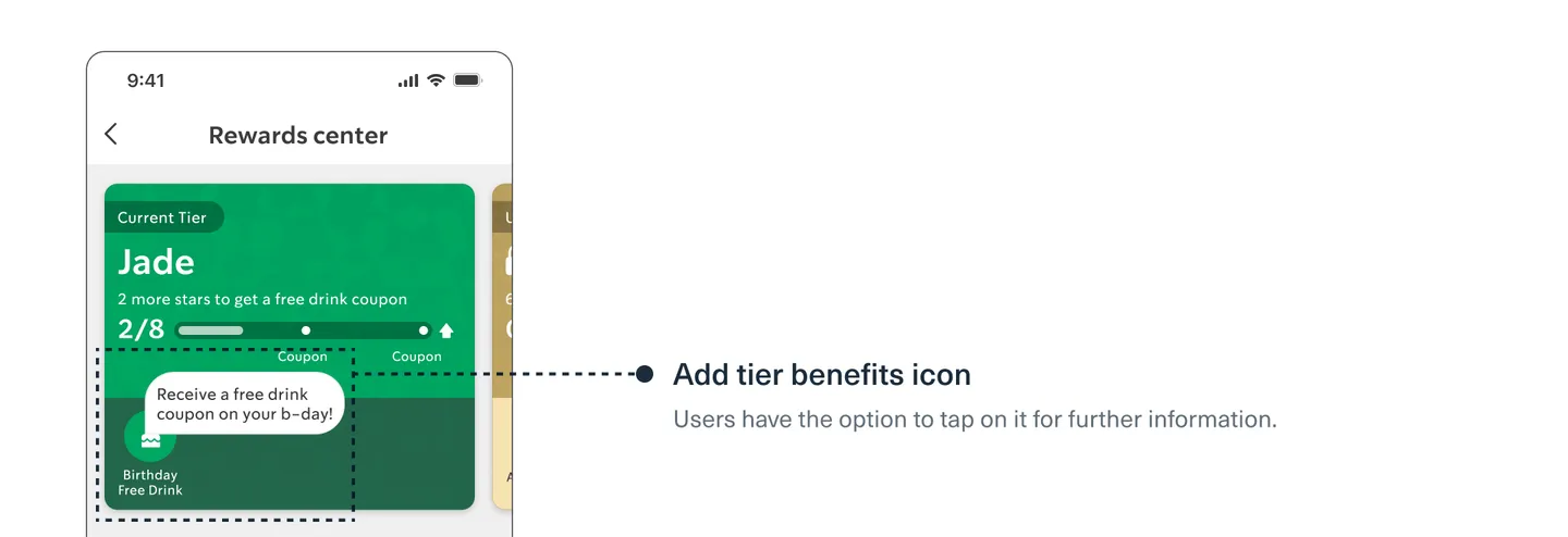
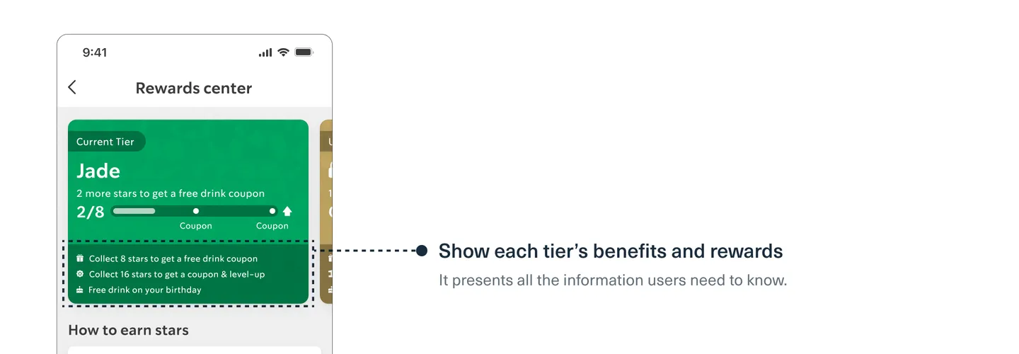
Solution 1: Enhance visibility
A deeper dive into the problem
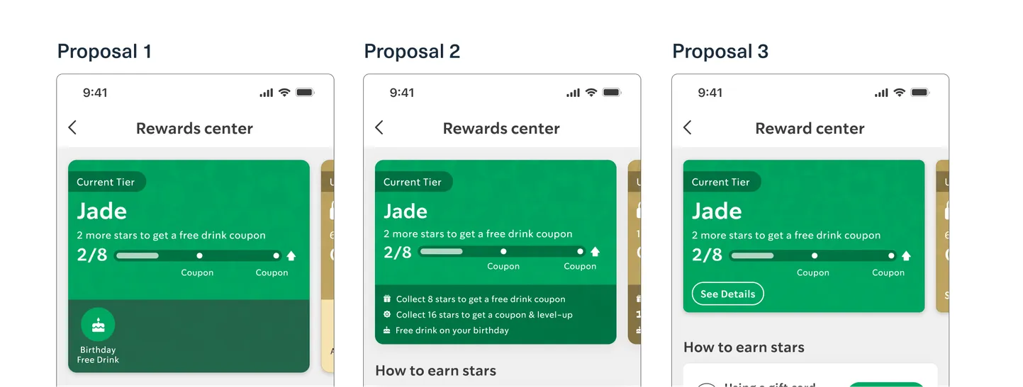
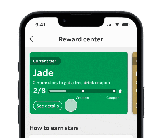
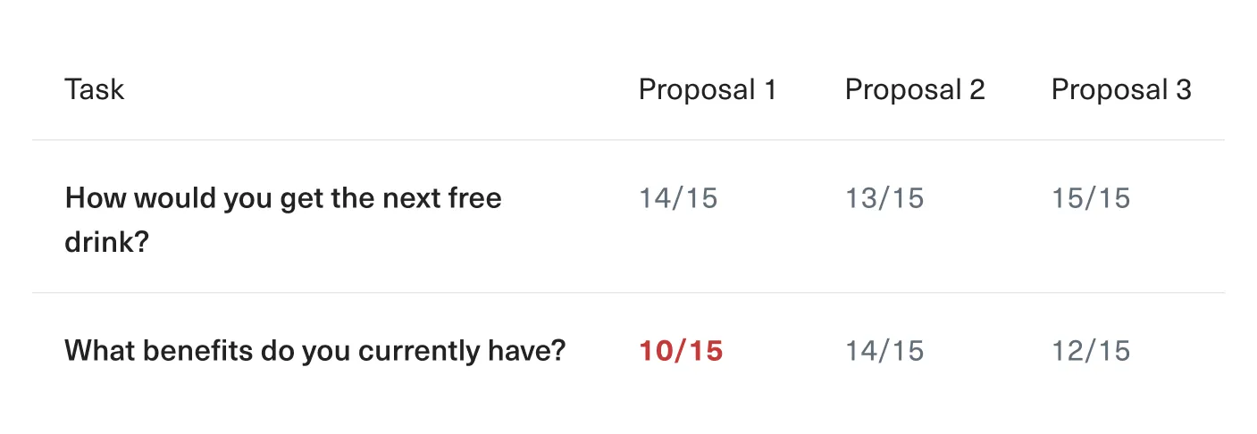
Validation: Usability testing
# of participants: 15
We conducted usability testing and discovered that some users
didn't realize the badge
from
proposal 2
was
clickable, preventing them from finding the additional access to the Rewards
center.
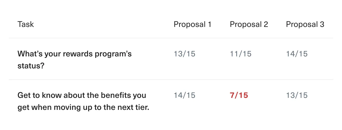
Between proposals 1 and 3, we found that proposal 3 had better
visual hierarchy and
readability.
This made proposal 3 our final choice.
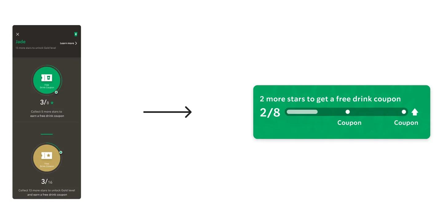
Solution 2: Apply intuitive design language
A deeper dive into the problem
Brainstorming
Before we begin, we asked ourselves one question:
How can we transform all this information to make it easier to understand?
And we immediately thought of cards.
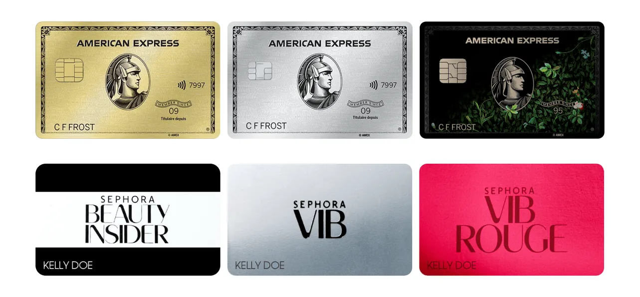
The card design seems like a mature and familiar solution to present tier information.
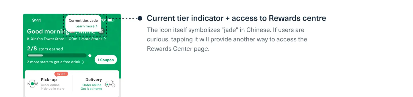
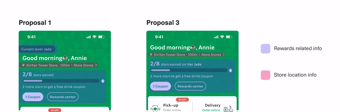
Validation: Usability testing
# of participants: 15
We conducted usability testing and discovered that some users didn't realize the badge
from
proposal 1
was
clickable, preventing them from finding their current benefits.
The problem with the Proposal 2
This particular design is text-heavy. Some users only care about when to get the rewards, so
they
don't
need all
that information.
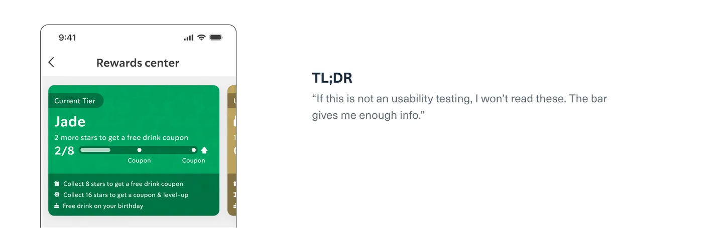
This made proposal 3 our final choice.
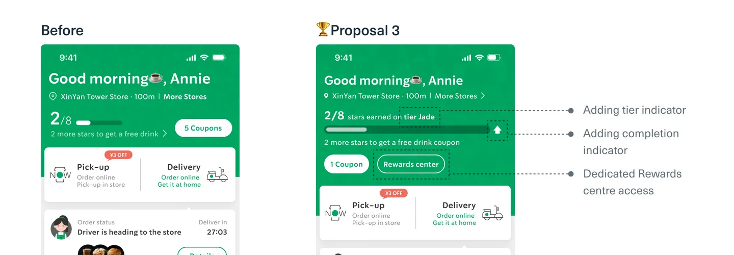
Final design

Delighted business team
By moving the "How to earn stars" section to a more prominent
position, the
business team
is
confident that it will help increase sales through the
Rewards Center page.