Overview
Company
- Smile Solutions
- Dental practice chain, Northeast US
Project
- New‑patient scheduling
- Intake context integrity
Team
- Product Designer (Me)
- PM
- Devs x 3
My role
-
Product thinking: define the right problem, scope, and evaluation criteria
-
UX: end‑to‑end workflow design + edge case
handling
- UI: admin workflow + patient intake form
- Post‑launch: performance monitoring, bug fixing, and iteration based on real usage
What I shipped
A two‑part experience that
fixes how new‑patient details get into the schedule: move
capture to the patient, then give admins a structured channel to
verify and complete those details before anything reaches the
practice management system.
Patient side (B2C)
A intake form sent via SMS or email, completed on the
patient's own time.
Staff side (B2B)
An admin workflow (send → receive → review →
finalize) that turns raw patient responses into a locked,
schedule‑ready summary.
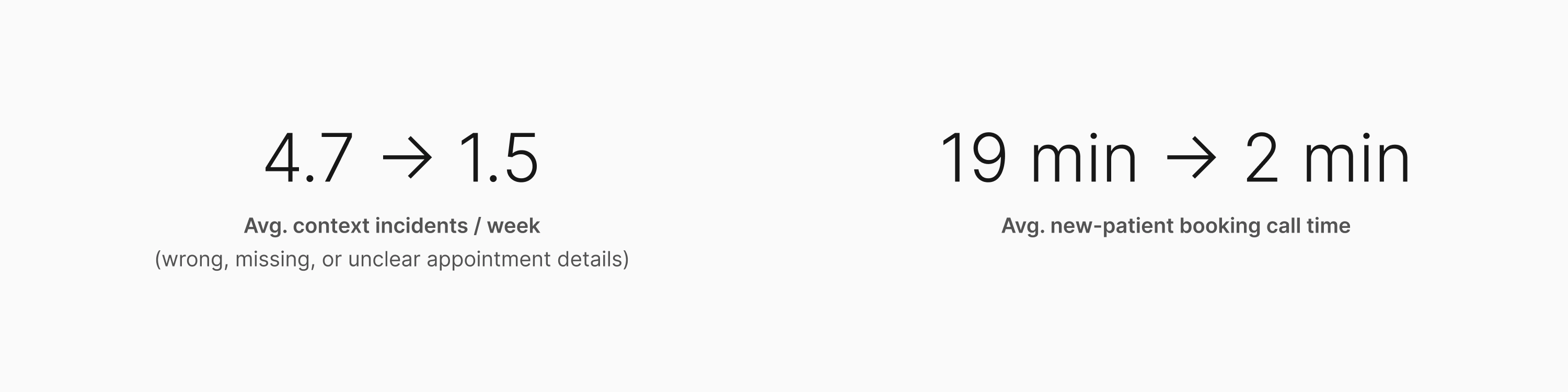
Impact
The redesigned intake flow reduced appointment context incidents
and shortened new-patient booking calls.
The Problem
The schedule wasn't just wrong. It was trusted anyway. That's what
made it dangerous.
The schedule is the clinic's nervous system
At Smile Solutions, the schedule is the document everyone works
from. Clinicians, assistants, and admins all depend on it to know
what's coming and how to prepare. When it's accurate, the clinic
runs. When it isn't, everyone downstream pays the price.
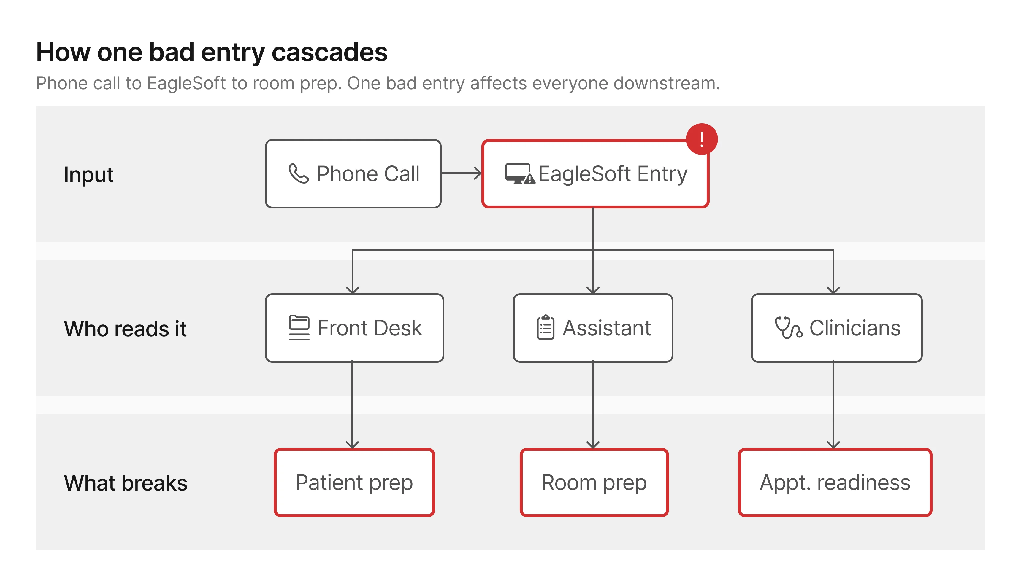
All booking records, patient notes, and appointment summaries live
in EagleSoft, the practice's management platform.
It's the source of truth. And
it's where unreliable data caused the most damage.
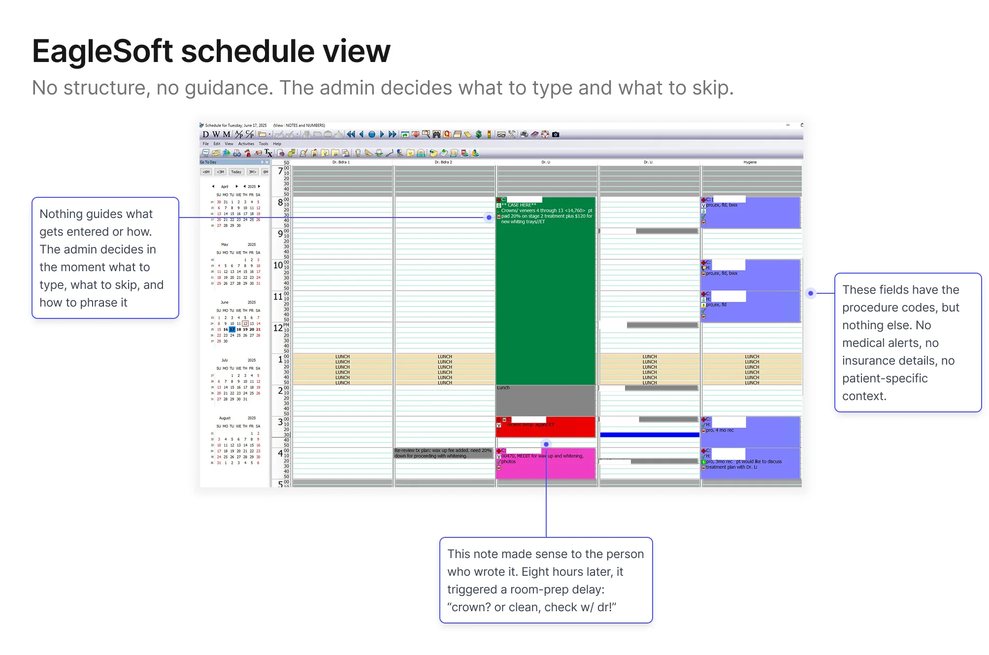
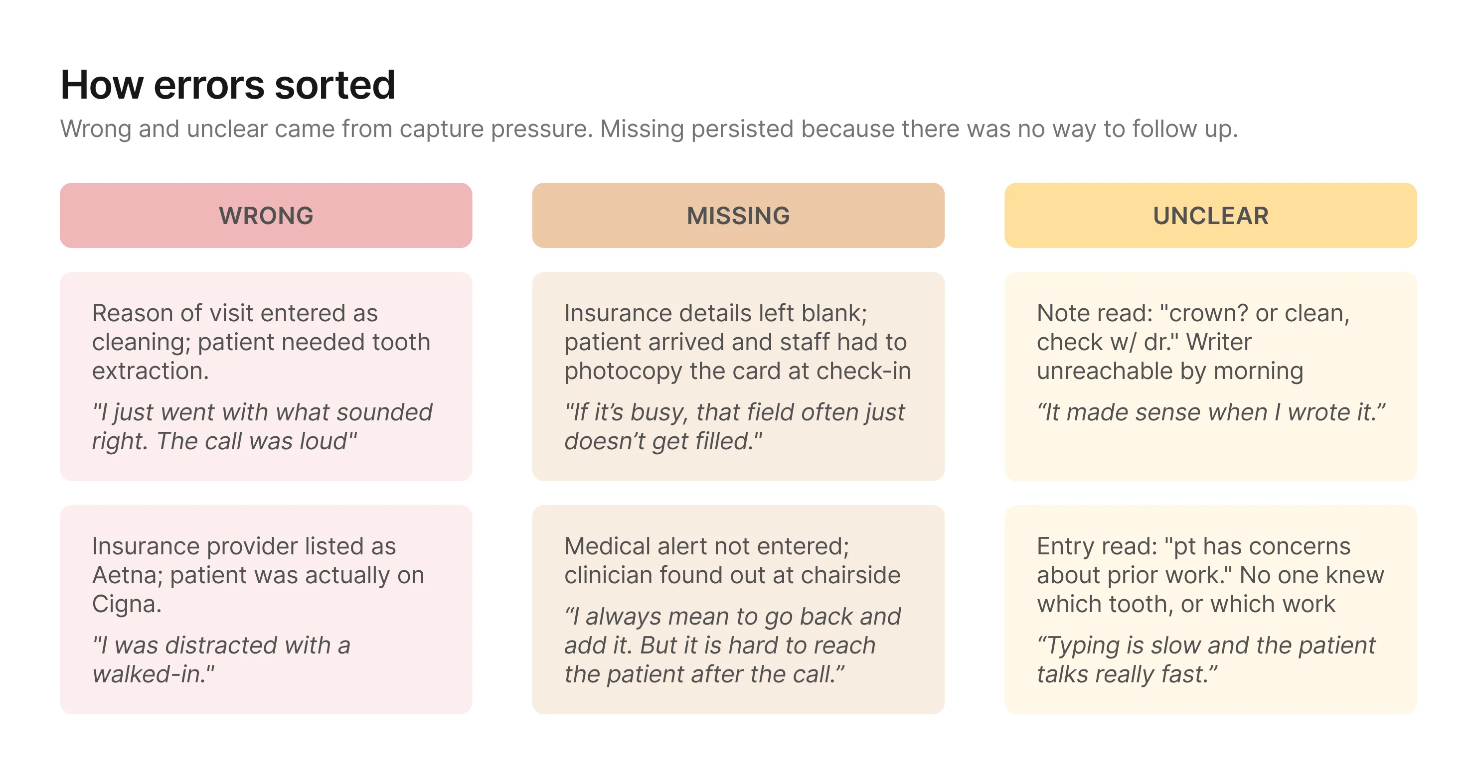
New‑patient bookings were the consistent weak point: wrong
procedure types, missing insurance details, shorthand notes that
only made sense the moment they were typed. By the time someone
needed that information (usually 8am on the morning of the
appointment) the admin who wrote it had moved on to dozens of
other calls since, and couldn't reconstruct what they meant, let
alone what they left out.
A day‑of story
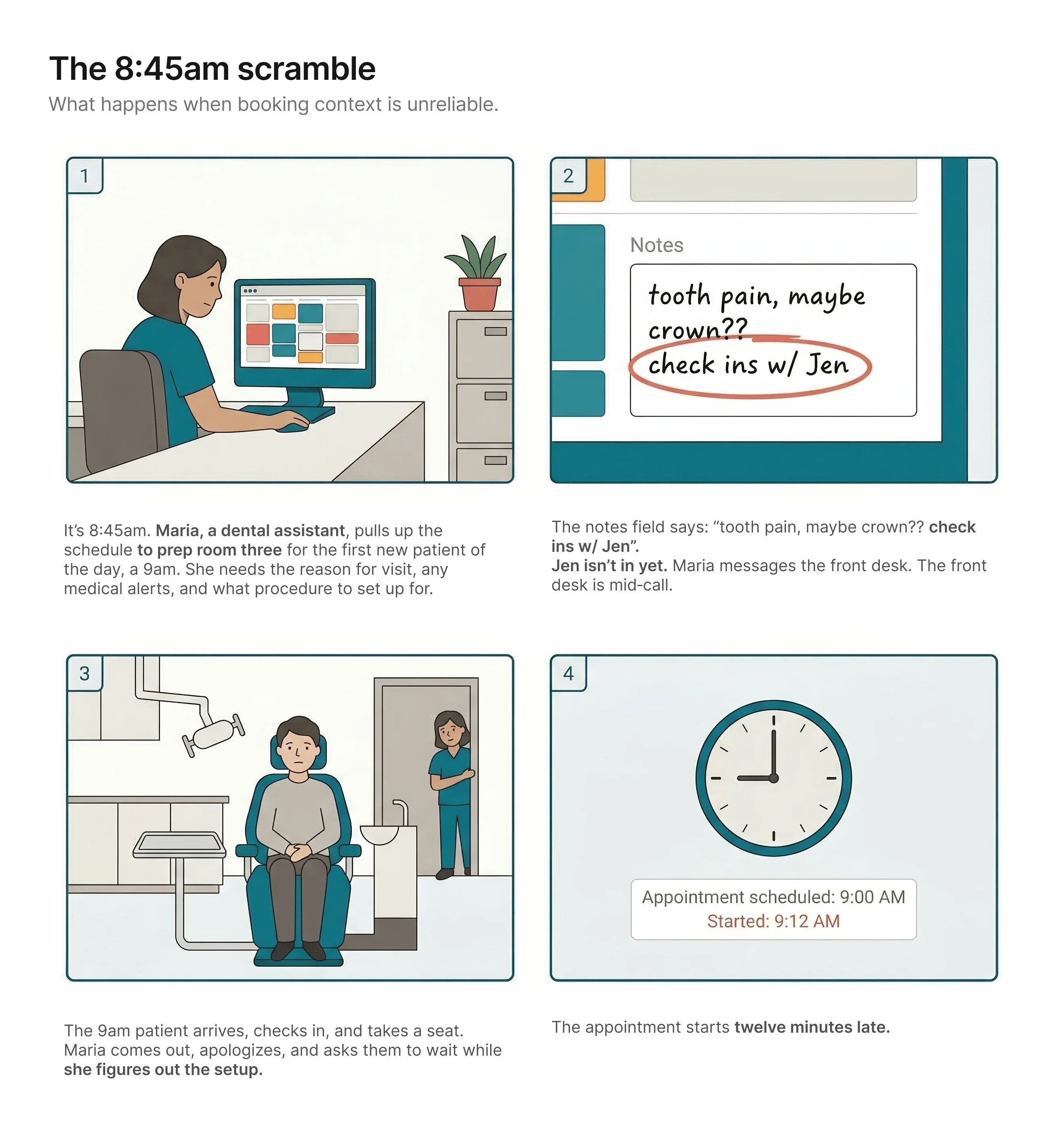
The patient never finds out why. From where they're sitting, the
practice just wasn't ready for them. It's their first visit. It's
the impression they'll carry.
Nobody made a bad decision. The workflow made this outcome
likely.
What this looked like across the practice
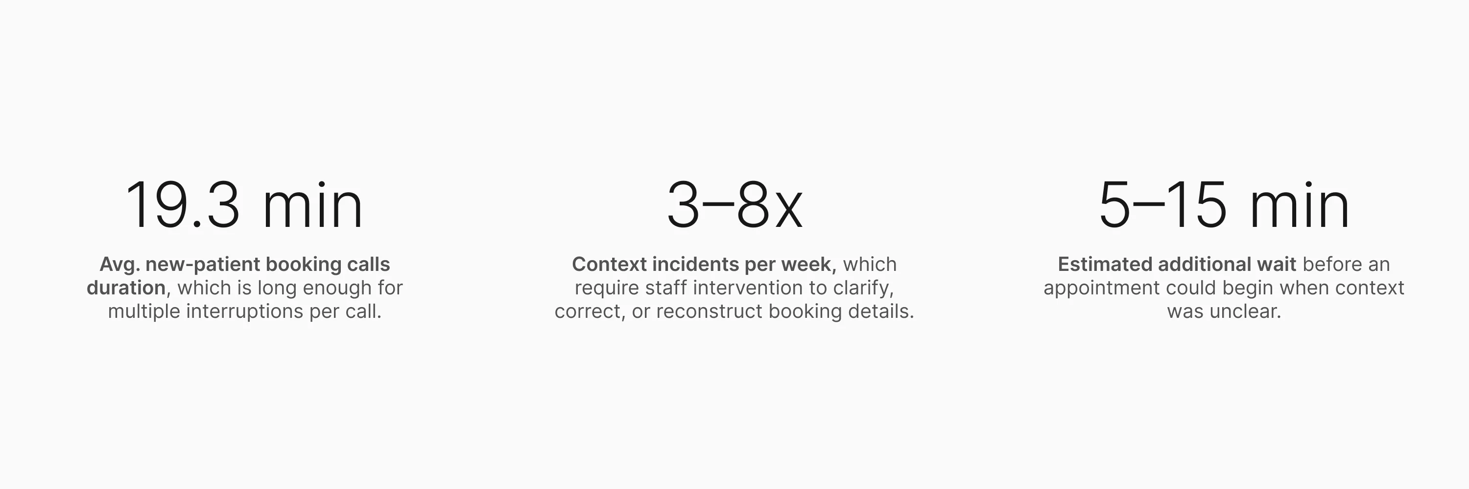
Staff estimates (not formally tracked at the time): ~60% wrong
details / ~25% missing info / ~15% unclear or illegible notes.
The numbers made the cost legible. But they didn't explain the
cause. For that, I needed to get closer.
Research
I went in assuming I knew what was broken. The research agreed with
me, and then kept going.
What I did and why
The numbers pointed to an obvious explanation: long,
pressure-heavy phone calls were causing the errors. What I didn't
know yet was whether that was the full picture.
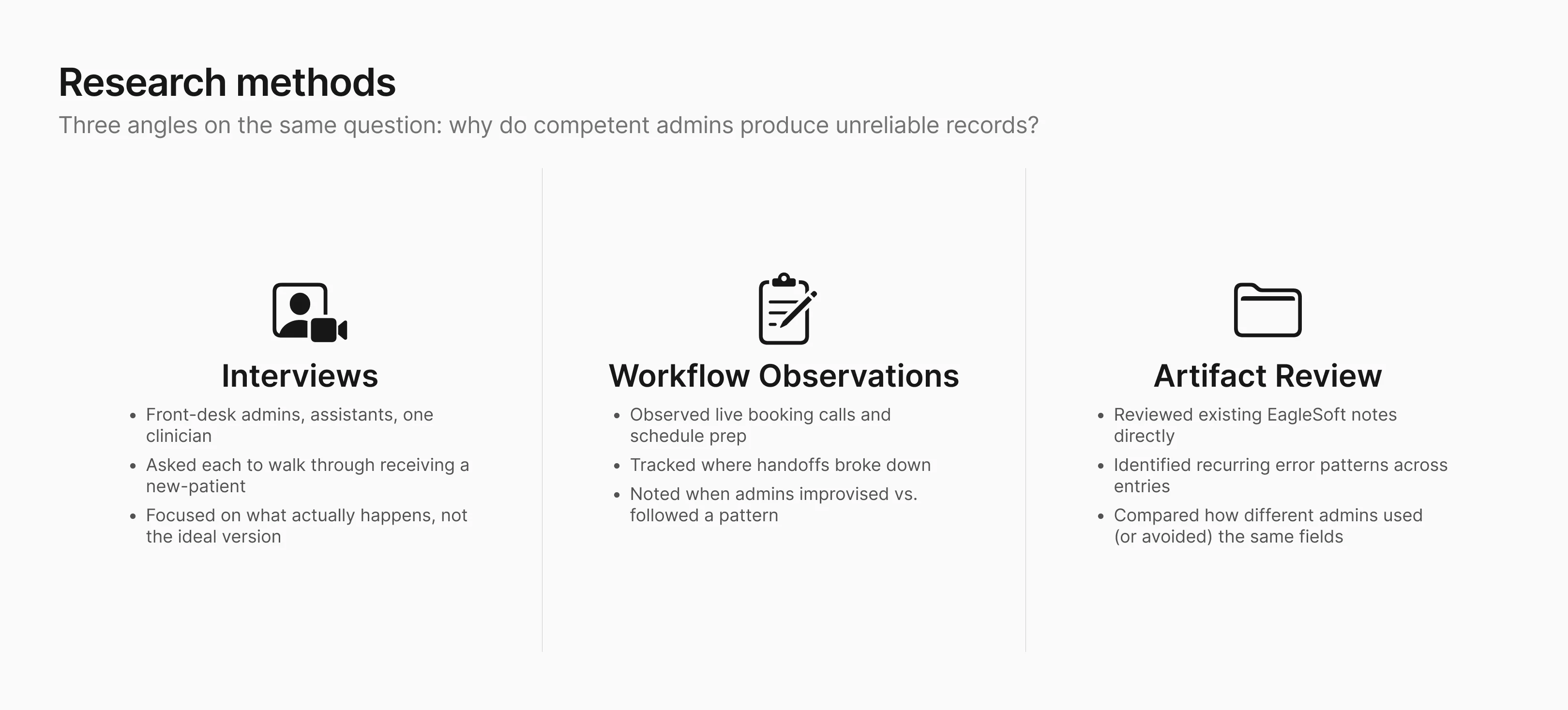
I ran interviews with front-desk admins, dental assistants, and a
clinician. I asked each of them to walk me through a recent
new-patient booking: not the ideal version, but what actually
happens, including when it goes sideways. I also reviewed the
schedule artifacts directly: existing EagleSoft notes, recurring
error patterns, and how different admins used (or avoided) the
same fields.
Who I designed for first
Although the problem affected both clinic staff and patients, I chose to focus first on front-desk admins.
They're the entry point for every new‑patient record, the
point where most errors enter the record, and the people who have
to fix things when context goes wrong. Solving for them would
reduce the burden on everyone else downstream.
What I found, and what expanded the scope
The capture problem was what I expected: admins were collecting
patient details over the phone, transcribing what they heard under
time pressure, and the results were unreliable. But one admin
said:
"I know the information is probably wrong when I hang up.
But there's nowhere to go back."
The first half confirmed the capture problem. The second half expanded the scope: even with
better capture, some details will still arrive wrong or incomplete. When that happens, the
clinic’s only fallback today is to call the patient back, which often goes unanswered, or ask
again at check-in, which is already too late. The solution therefore needed to improve capture
and give the clinic a way to close gaps before the appointment.
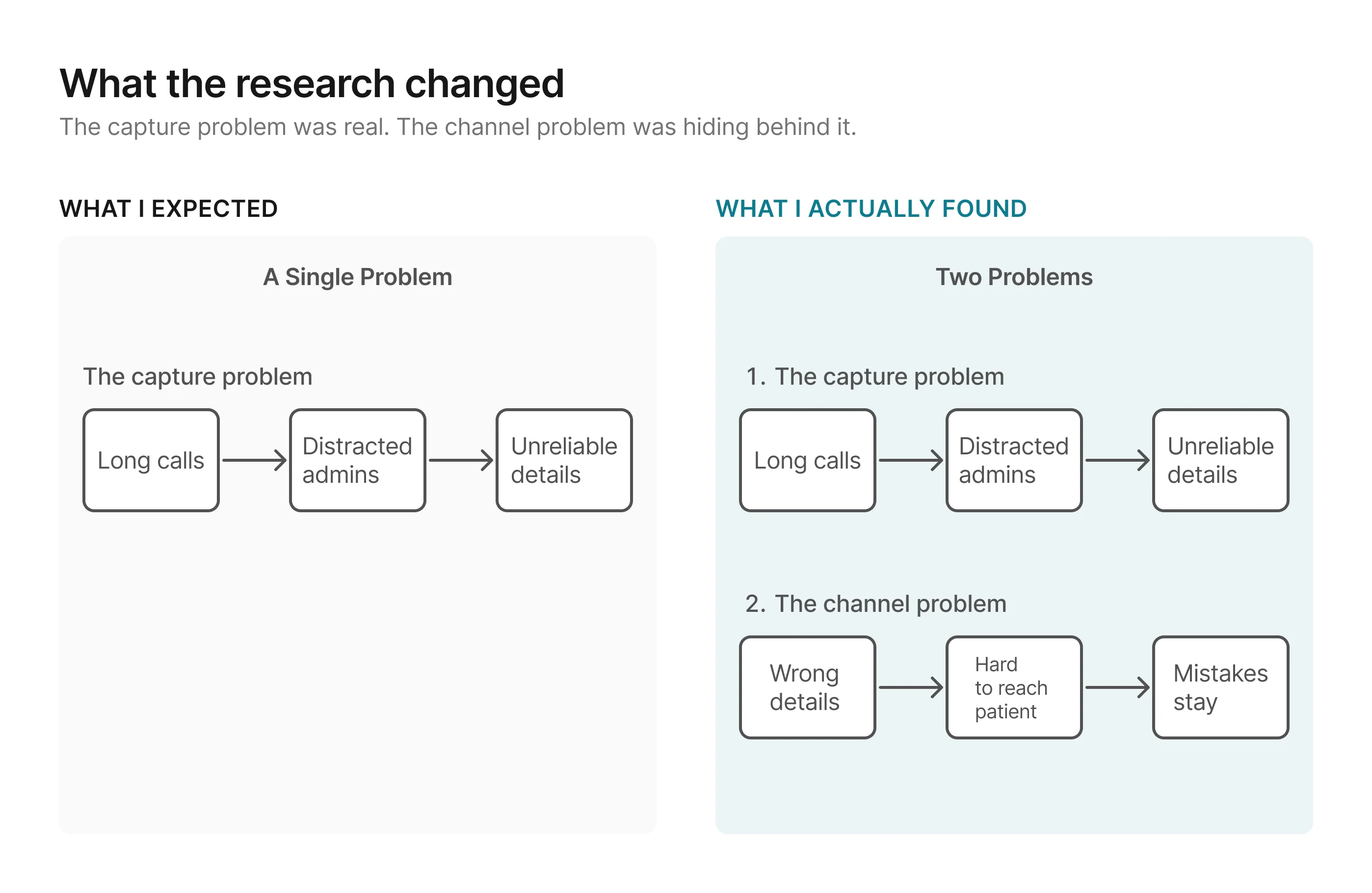
Without a channel to catch those gaps before appointment day, the
clinic ends up right back where it started.
The failure modes sorted into three consistent buckets:
Together, these patterns pointed to a bigger design problem: the
clinic needed a way to improve capture and a way to close gaps
before those details became schedule truth.
Design Principles
The research surfaced two problems, not one. Any direction needed to
improve how details get captured and give the clinic a
structured way to verify and complete them before they reach the
schedule. With that framing, I set three principles to evaluate
directions against.
1. Reduce pressure on the capture moment
The research showed that most wrong and unclear details traced
back to the same condition: admins transcribing what they heard
under time pressure. Any direction should move as much capture
as possible to a lower-pressure context.
2. Verification should test for downstream readiness
The goal is not just to confirm that information was captured. It is to make sure the record
is clear and complete enough for the people downstream, especially clinicians and
assistants, to prepare with confidence. A direction is stronger when its verification step
can judge readiness for use, not just whether someone recognizes what was said earlier.
3. The verification process should be reliable at scale
Missing details persisted because the only options were call
back (unreliable) or ask day-of (too late). Both depended on
someone remembering to act. The process needs structure that
surfaces what's missing and makes follow-up a built-in step.
Ideation
Each direction attempted to meet the design principles differently,
and that's what separated them.
I explored three directions. All three reduced pressure on the
capture moment and created some form of verification. What
separated them was how well each held against the second and third
principles.
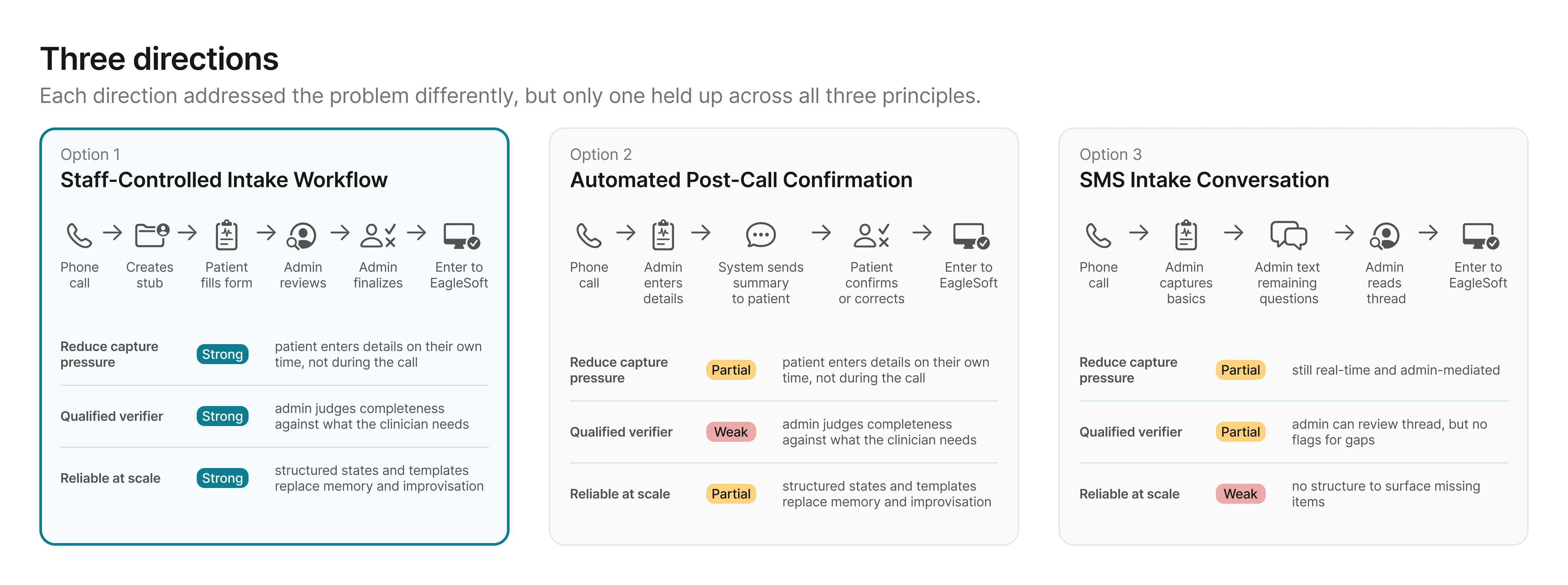
Options 2 and 3 each addressed part of the problem, but both left
gaps the principles were designed to catch: the wrong person
verifying, or no structure to surface what's missing. Option 1 was
the only direction that scored strong across all three. The
remaining question was whether the effort to build it was
proportional to the impact.
The principle ratings narrowed the options. The next question was how much effort each one would
take.
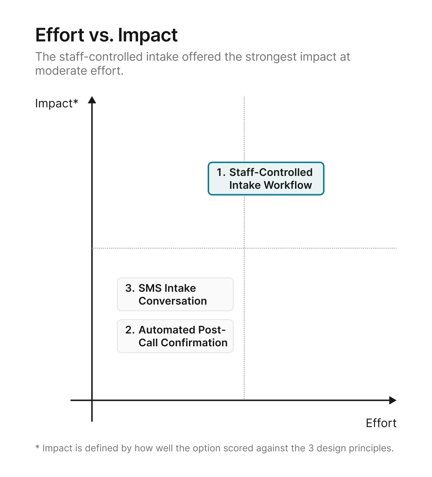
A structured intake form, a review tool, and a finalize step take
more effort to build than a post-call confirmation or an SMS
thread. But the principle ratings made the tradeoff clear: the
options that required less effort also produced weaker results on
the problems that mattered most.
With the direction chosen, the next step was to flesh out the details of how the
staff-controlled intake workflow would work.
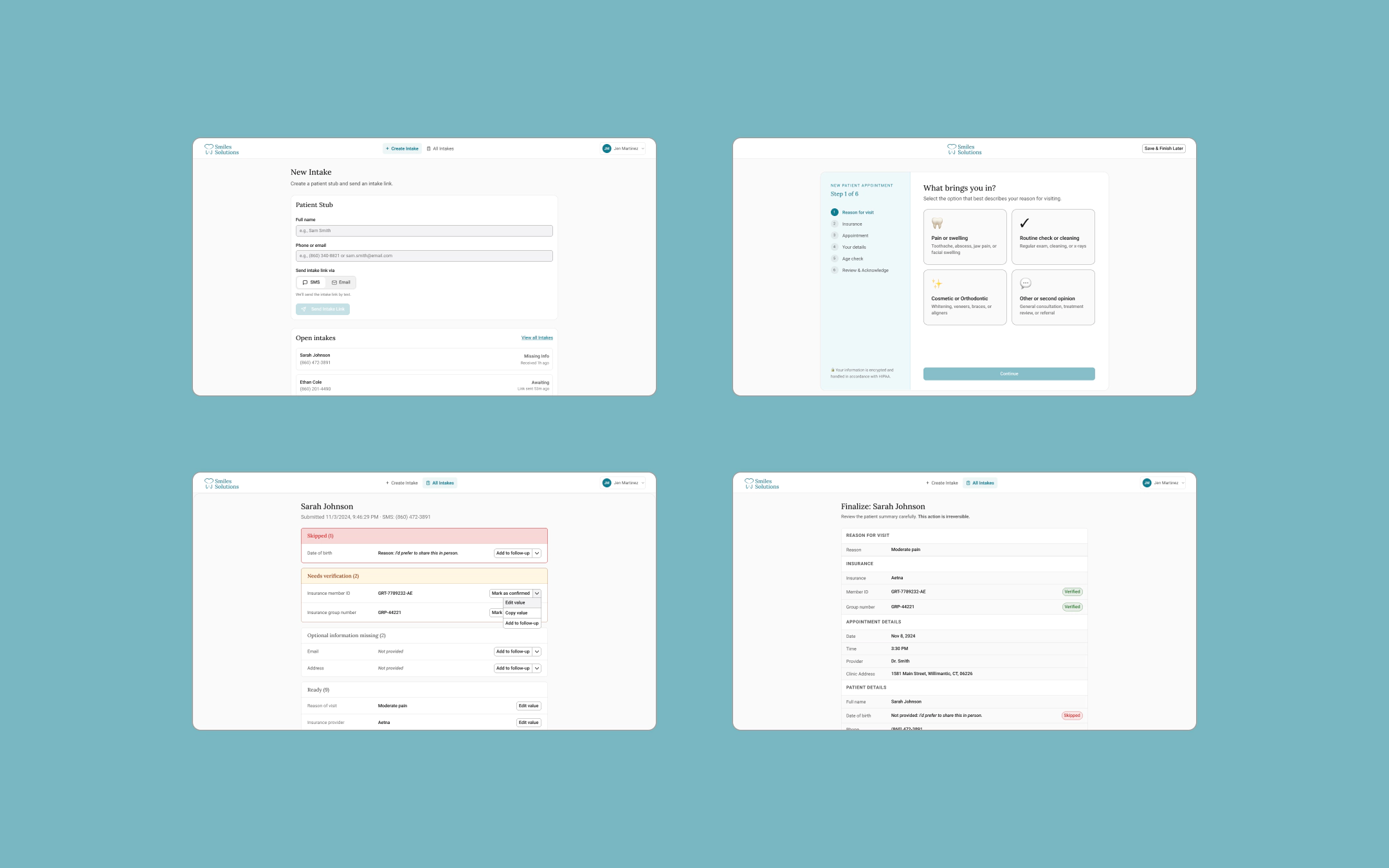
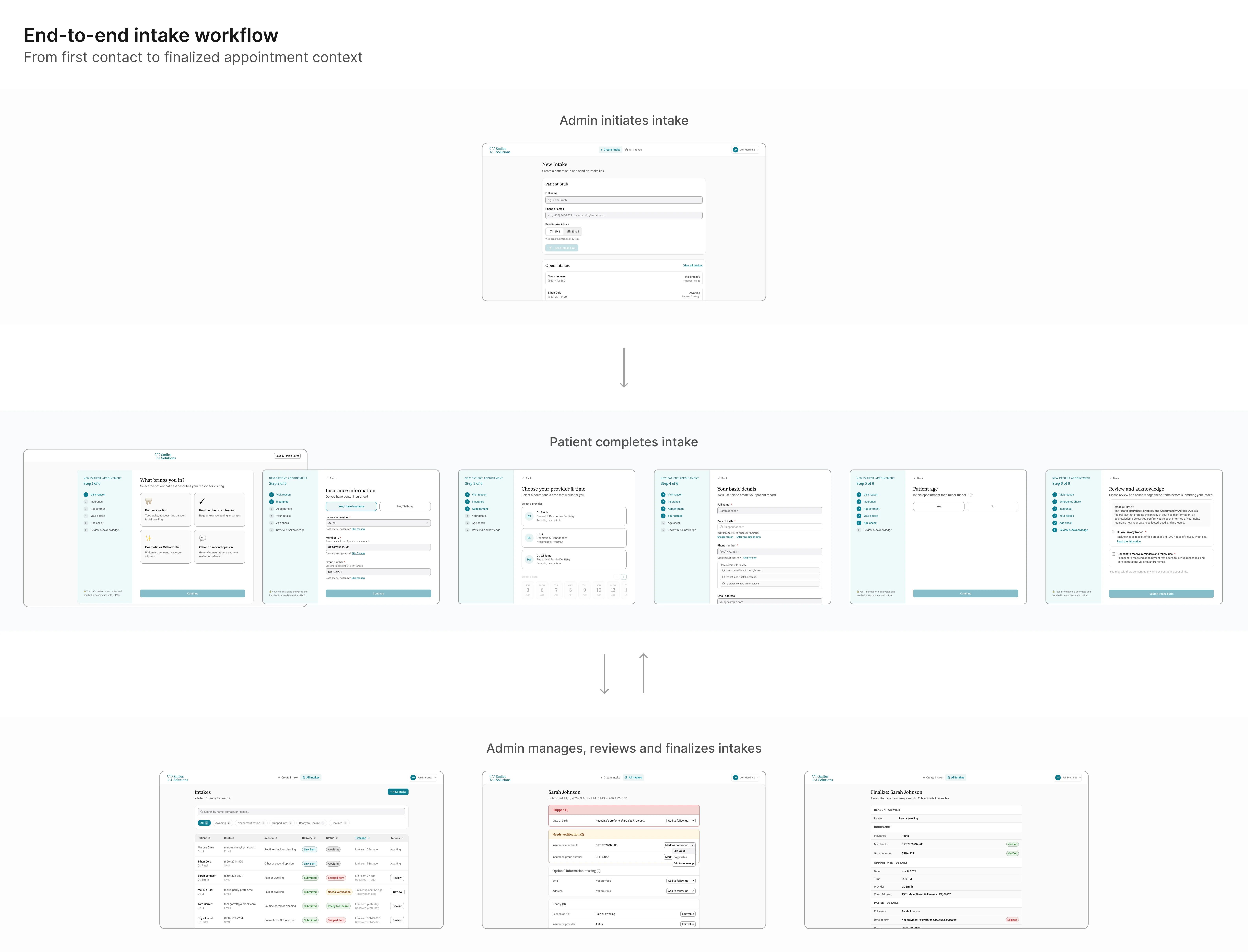
Solution: The staff-controlled intake workflow
Option 1 scored strongest against all three principles. Here's how
it works in detail.
The workflow splits into two phases.
In the first, capture moves off the phone and onto the patient. In
the second, the admin has a structured channel to verify what came
back, close gaps, and lock a clean summary before anything reaches
EagleSoft.
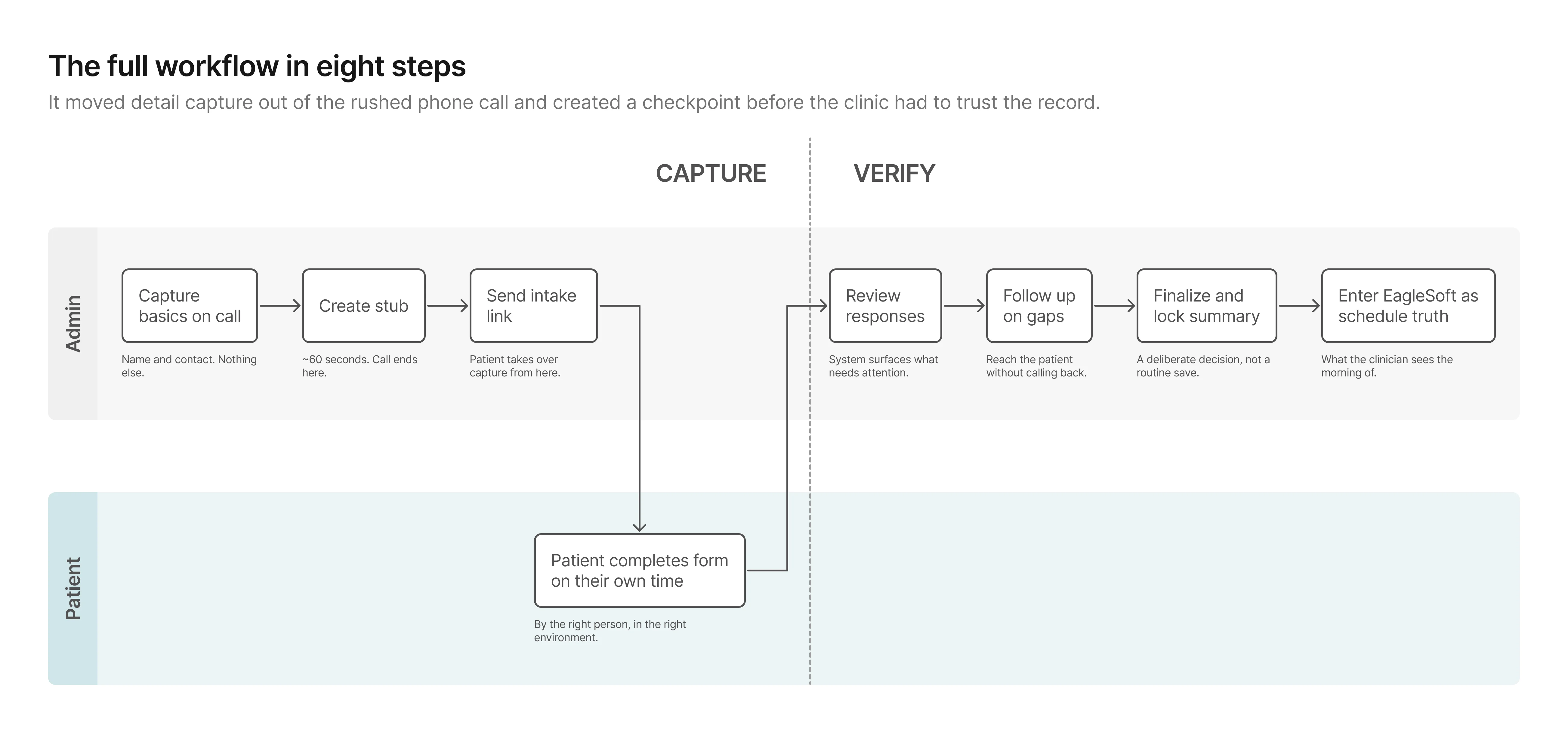
Phase 1: Capture
The stub keeps the phone moment minimal and hands capture to the
person who actually has the information. The patient fills out the
form on their own time, producing data the admin can review rather
than data the admin has to reconstruct.
Phase 2: Verify
This phase didn't exist before.
Previously, once details were wrote down, they were effectively
final. Now the admin can see what came back, close gaps
asynchronously, and lock a clean summary before anything reaches
the schedule.
From workflow to prototype
The workflow held at a high level. What I needed to test next was
whether the first screen-level version of it would actually work in
practice.
How I explored UI directions with AI
I used Uizard and
Galileo AI to generate multiple
layout directions quickly before investing time in any single one.
Both tools let me describe a screen in plain language and get a
rendered result in seconds. Uizard was faster for generating
multi-screen flows; Galileo produced higher-fidelity individual
screens I could pull directly into Figma. The goal in using both
was the same: compress exploration time by spending less of it
generating and more of it evaluating.
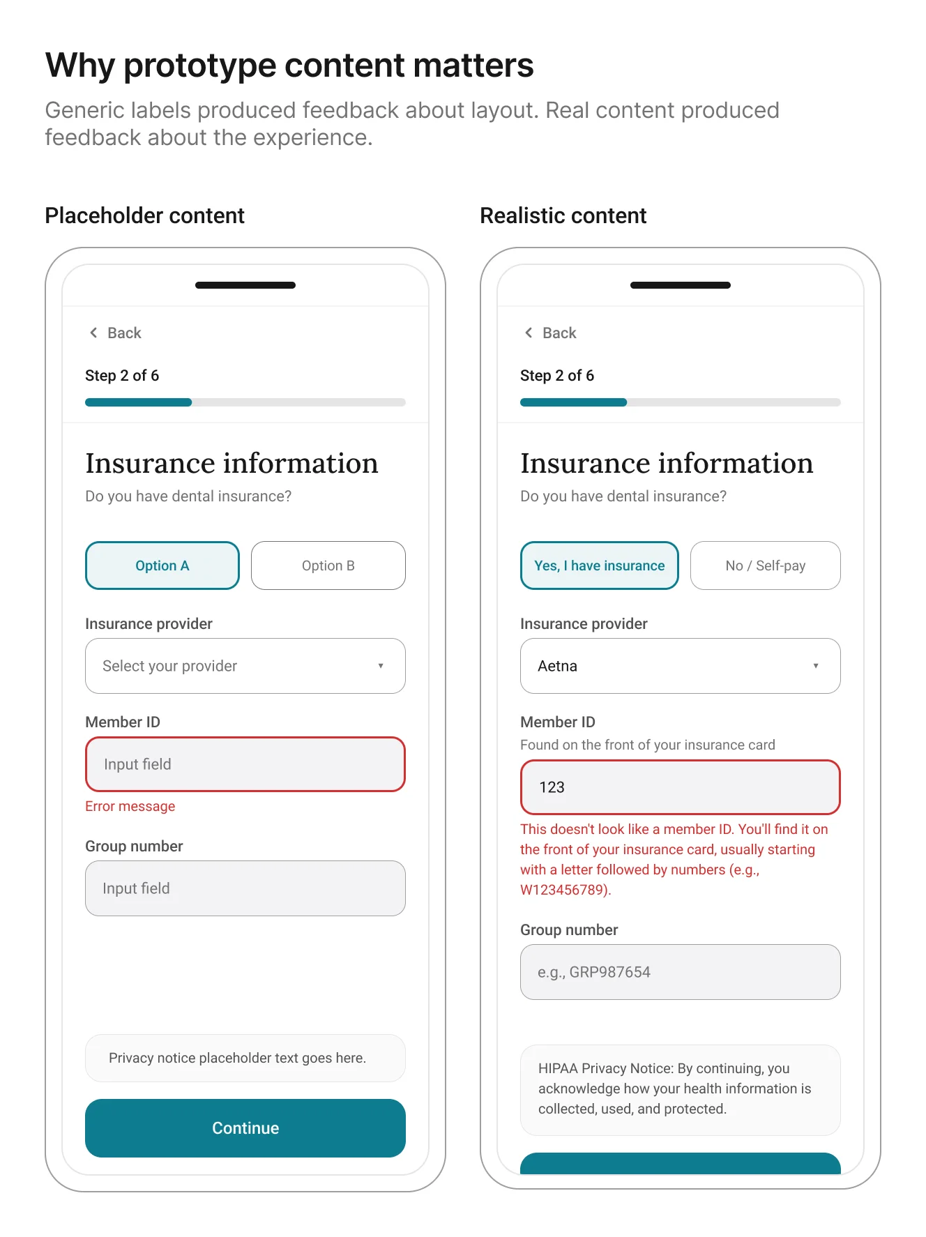
Below is an example of the UI exploration for the review screen.

The more useful discovery was not about layout. It was about
content fidelity. Once I
used AI-generated realistic patient details, insurance
questions, and error states
in the prototype, participants stopped reacting to the generic information
and started reacting to the actual experience. That made the
feedback more specific and more useful.
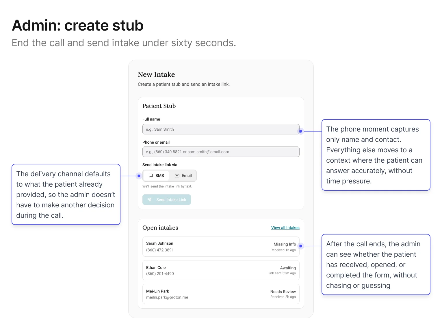
Screen 1: Admin – Create stub + send intake link
Goal: keep the phone moment fast. The less that happens here, the
less that can go wrong.
The central decision in this screen was restraint: specifically,
what not to ask. Early explorations tried to collect too
much during the call, which recreated the original problem in a
new interface. Filtered through the first design principle (reduce pressure on the capture
moment), the stub settled on two fields: name and contact. Everything else defers to
the patient.
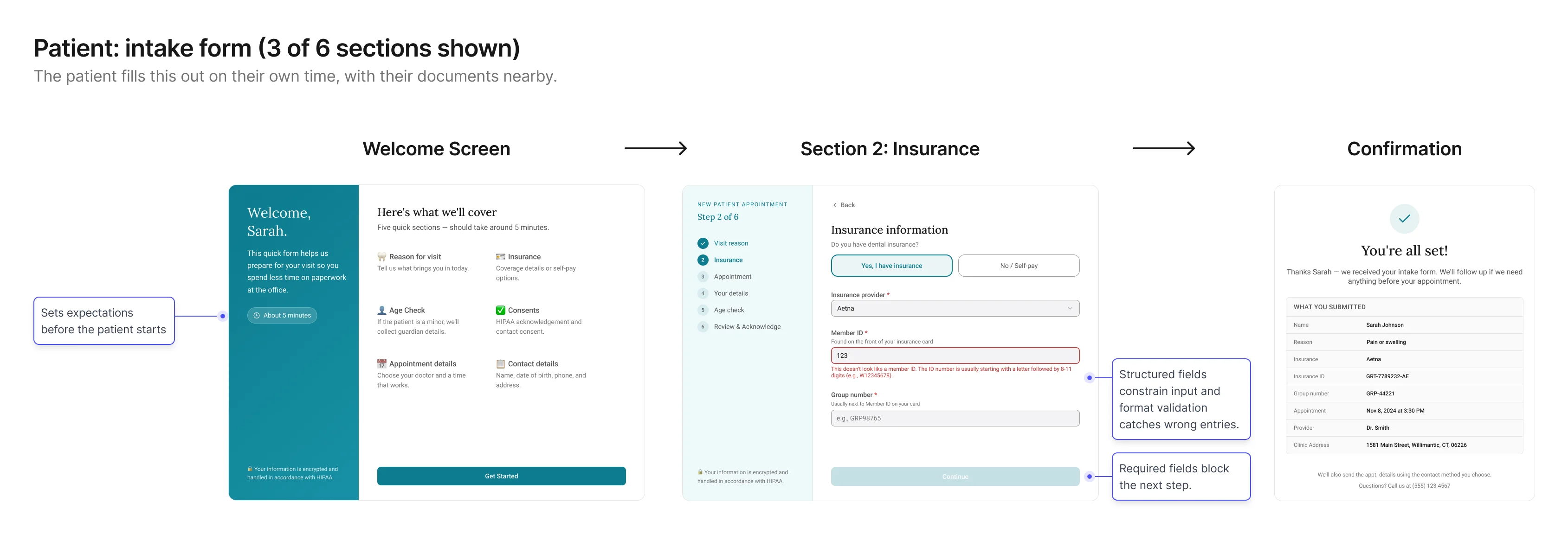
Screen 2: Patient – Intake form
Goal: collect structured, trustworthy details without phone
pressure.
This screen shifts capture into the environment where patients are
most likely to answer accurately: on their own time, with their
information in front of them. The form is designed to make simple questions easy to answer,
reduce uncertainty, and clarify why sensitive information is needed.
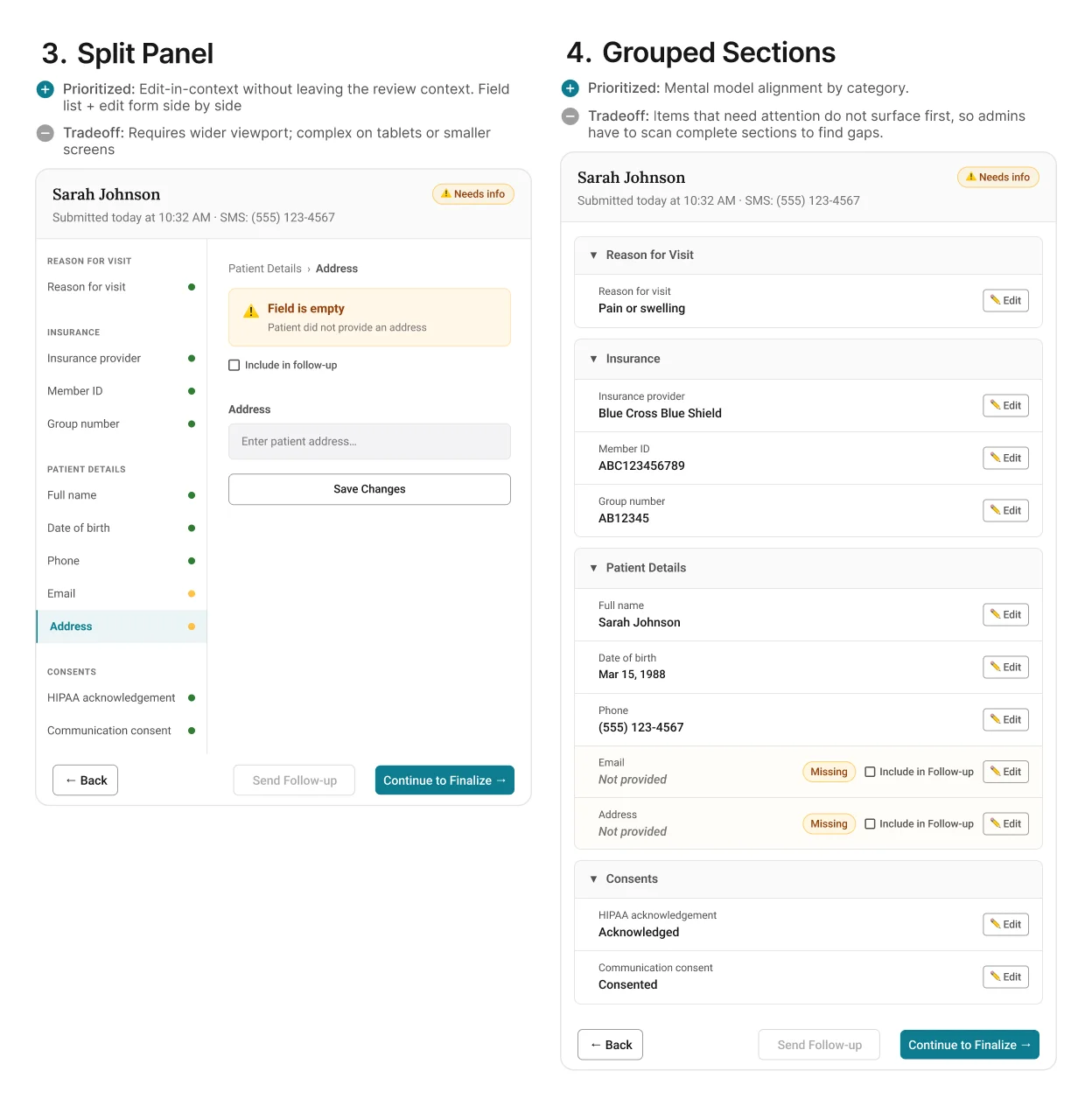
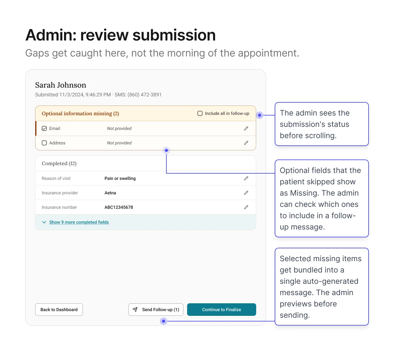
Screen 3: Admin – Review intake + resolve gaps
Goal: give admins a view of everything the patient submitted so
they can verify before it enters the schedule.
This is the core of the verification channel. The patient has
submitted their information. Now the admin needs to see what came
back and decide whether it's ready for EagleSoft.
The screen shows every field organized by section, with edit buttons for direct corrections and
a fast way to follow up on anything left blank. Pre-written messages let admins reach out in
just a few clicks, instead of composing from scratch. Format validation has already filtered out
obviously wrong entries.
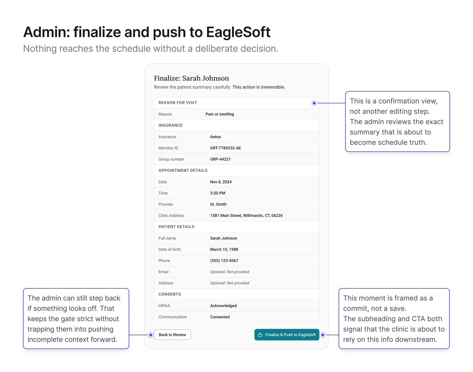
Screen 4: Admin – Finalize + Push to schedule
Goal: give admins a final check before the record enters
EagleSoft.
This screen sits at the end of the verification channel. The admin
has reviewed the intake, followed up on any gaps, and is ready to
push a clean summary into EagleSoft. The design shows a structured
summary of the record with a Finalize button at the bottom,
positioned at the close of the workflow once all prior steps are
complete.
Validation & Iteration
With the first version in place, I tested whether each phase worked
under realistic booking scenarios.
What I focused on
I put the screens from the previous section in front of
admins and participated patients with realistic booking scenarios and observed how
clinicians downstream used the output. I tested four things,
chosen because they were the closest proxies to whether both
phases were actually working:
Admin speed
Time from end of call to intake link sent. A proxy for whether
the stub was actually fast enough to keep the phone moment
light
Patient completion
Drop‑off points, confusing fields, time to complete. A
proxy for whether capture was producing trustworthy data
Review quality
How quickly admins could identify what needed attention. A
proxy for whether the verification channel was doing its own
work
Summary trust
The ultimate proxy for whether clean,
verified information was actually reaching the schedule.
What we found
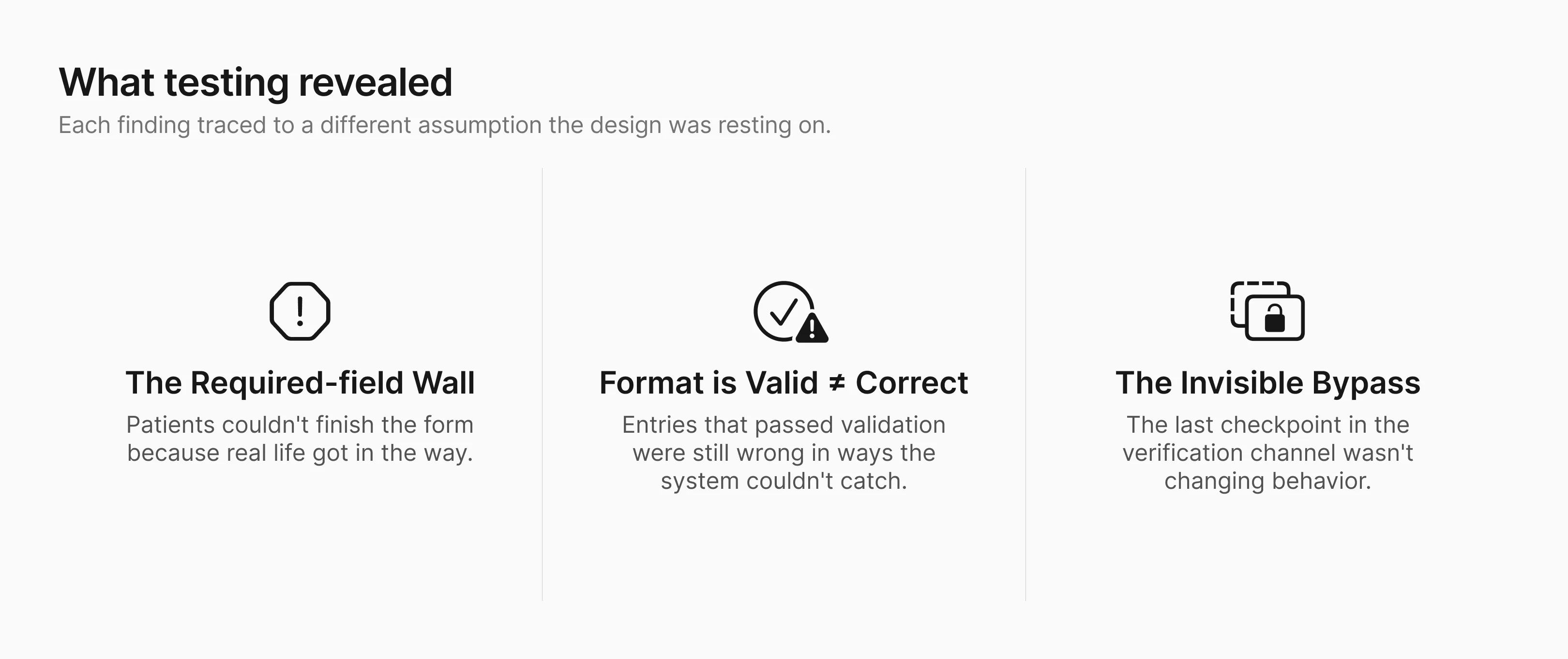
Finding 1: Patients who wanted to complete the form couldn't,
because real life got in the way.
Form completion rate was lower than expected. The helper text
was doing its job: patients understood what was being asked. But
many hit a required field they simply couldn't answer right now.
Their insurance card was at home. They were on a spouse's plan
and didn't know the group number. Some hesitated
on fields that felt too personal for a practice they hadn't
visited yet.
The original form gave these patients no way forward. Required
fields blocked the next step.
Patient's only options were to abandon the form or guess.
Most abandoned.
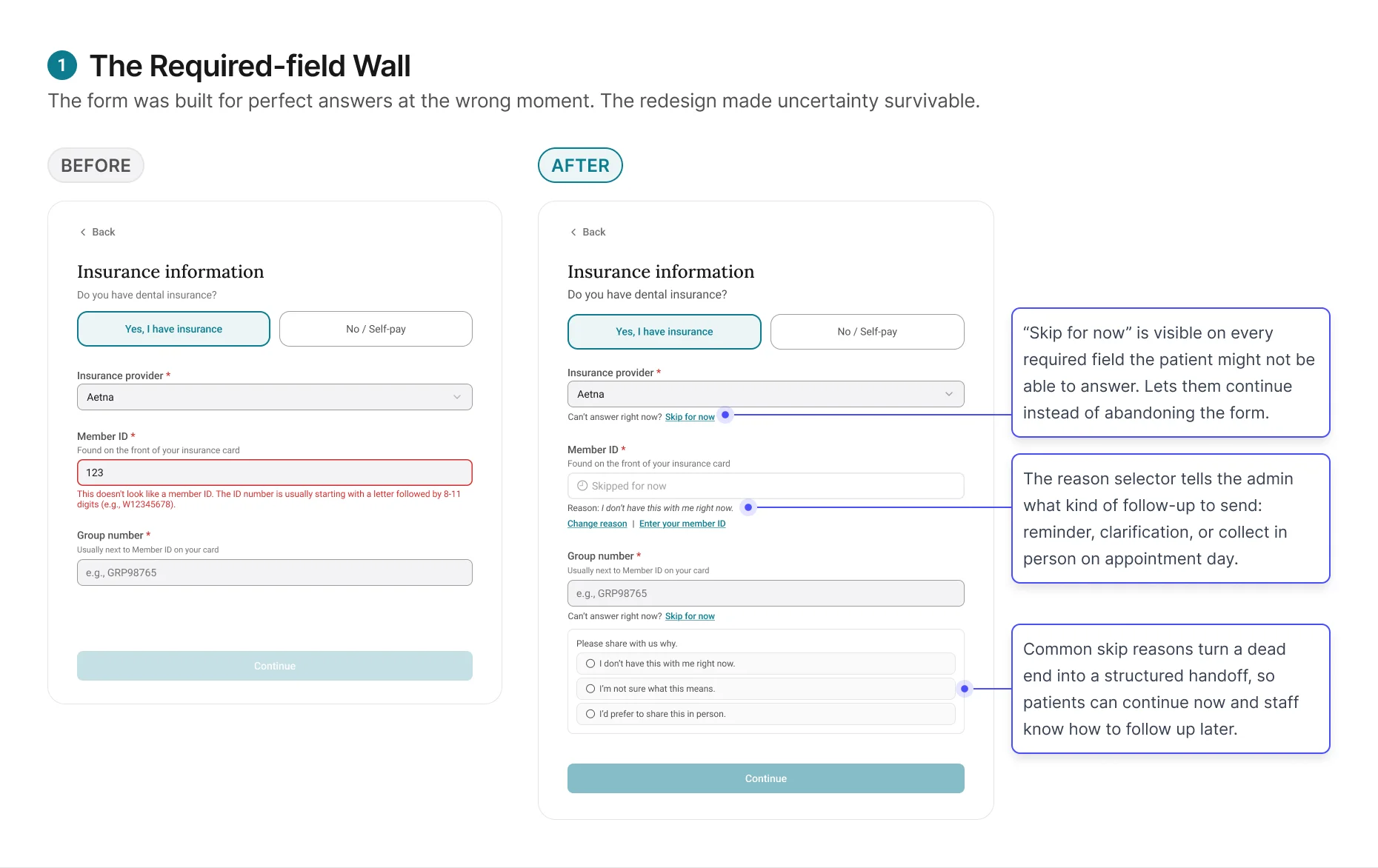
The redesign changed the form's job from forcing completion to
capturing honest progress. Patients could move forward without
guessing, and admins received enough context to decide whether
to remind, clarify, or collect the information later.
Finding 2: Format-valid is not the same as correct.
Skip for now solved the completion problem. But patients who did
fill in every field weren't necessarily giving the admin
trustworthy data.
The original review screen treated every format-valid entry as
completed. If the patient entered something and it passed
validation, the field showed green. But in practice, patients
entered information that looked right and wasn't. A patient on a
family plan entered the subscriber's member ID instead of their
own. Another entered their medical insurance details instead of
dental.
The format was correct. The data was wrong.
And the review screen gave the admin no reason to question it.
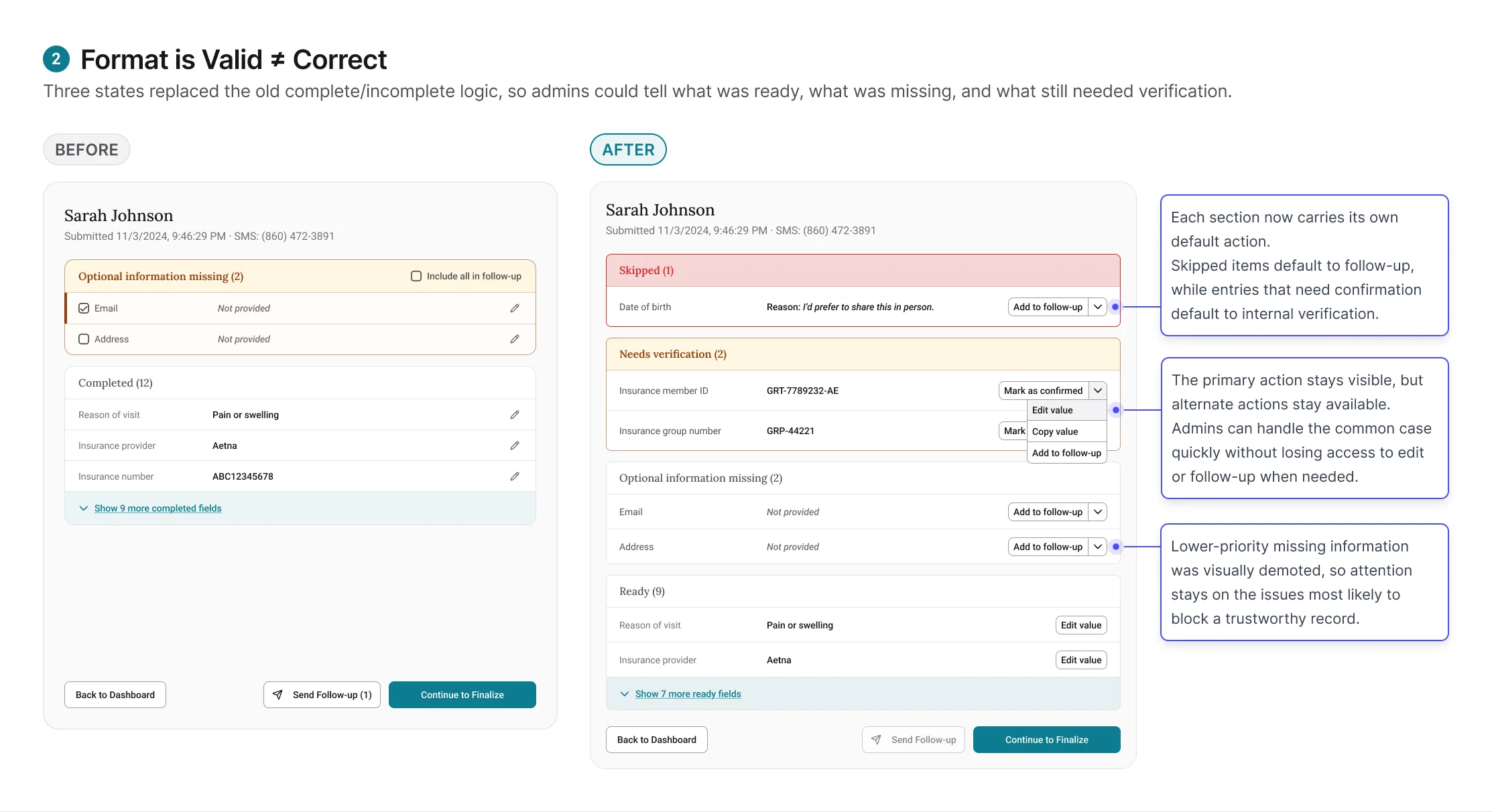
These tentative entries require the admin to verify against an
external system, like running insurance eligibility in
EagleSoft, before they can be trusted. Combined with the "Skip
for now" items from Finding 1, the review screen now has three
states: Ready (entered,
validated, admin has verified),
Needs verification (entered,
passed format validation, but requires admin to check against
EagleSoft), and
Skipped (patient tapped "Skip
for now," reason attached, admin follows up based on reason
type).
Finding 3: A checkpoint that doesn't feel like one won't
function as one.
The initial finalize screen passed every design review. It was
structurally correct. It sat at the right point in the workflow.
And it wasn't changing admin behavior.
Admins clicked through it the same way they'd always clicked
through EagleSoft saves: quickly, without pausing. Submissions with unverified items still
got through, not because admins were careless, but because the experience did not do enough
to signal that this moment was different from any other save action.
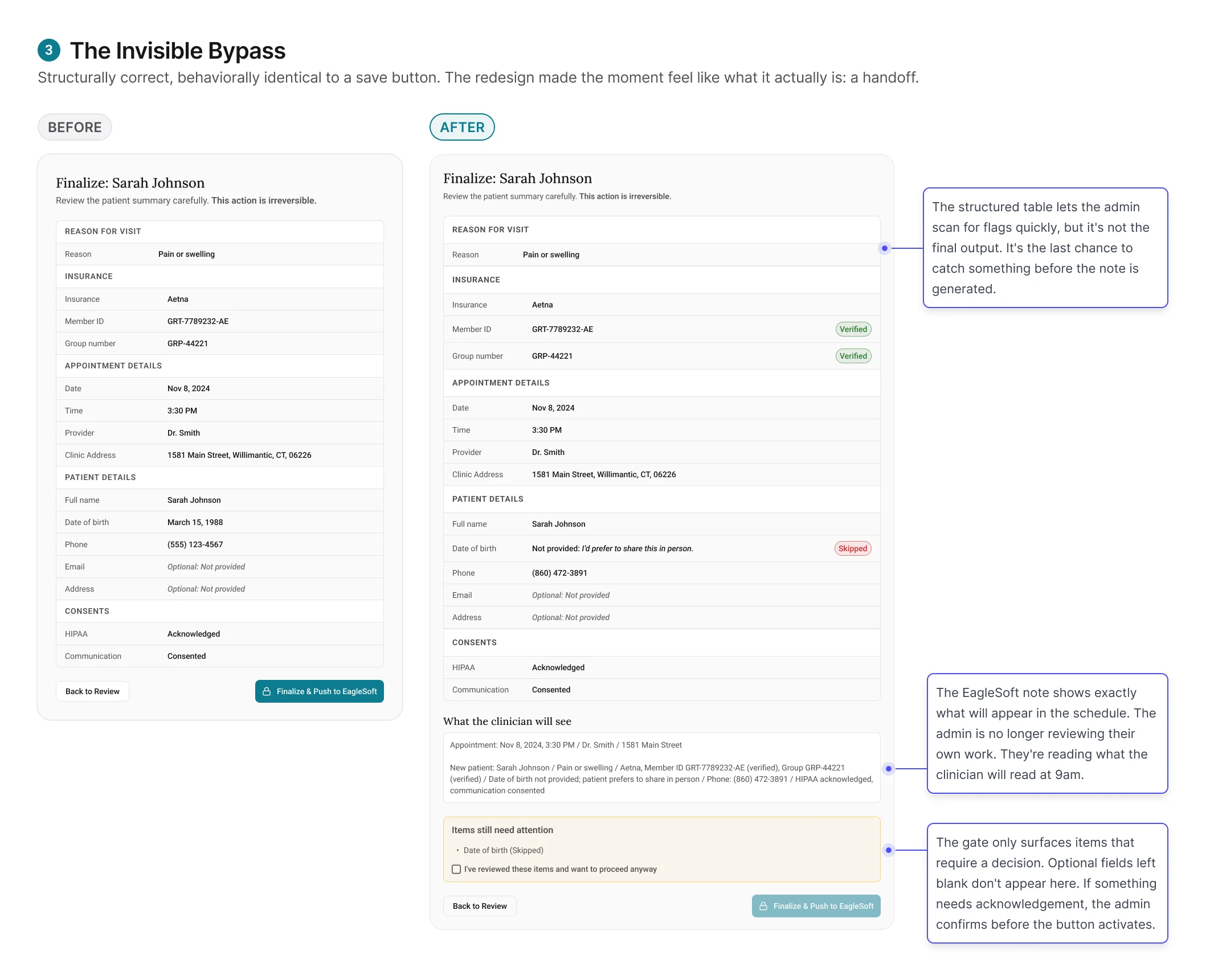
The redesign worked by changing the meaning of the moment.
Finalize no longer felt like the last click in a workflow. It
felt like committing a record that someone else would rely on
the next morning.